coin drop arcade
an all-in-one mobile companion for seamless arcade gameplay, dining, and reservations.
00
.problem
The traditional arcade setting has remained the same internally for many years, creating a disconnect between physical entertainment and modern digital experiences. Arcades are dependent on high-energy, group-play experiences, yet are hindered by outdated issues such as physical token systems, fragmented group experiences, and lost revenue due to long lines for food and drinks during peak hours. The problem is how to solve these issues without taking away from the gaming experience.
.solution
We created a digital companion that can modernize the traditional arcade by making the play-to-pay process much smoother. With a digital wallet for credits, group management, and mobile ordering, it can reduce lines and lost revenue for the arcade. The mobile interface is designed to be simple and intuitive, making complex systems easy to use and improving the traditional arcade experience.
Bridging the gap between physical arcade cabinets and a seamless mobile ordering system presents a massive structural challenge. This was a complex project balancing high-volume foot traffic with strict venue operations. Digitizing the core functions of a high-energy entertainment space is subject to heavy logistical and environmental constraints.
.constraints
The challenge of bringing our digital sidekick into the bustling world of the arcade floor was working with the tight hardware constraints and data bottlenecks that came with it.
Atmospheric UI: The challenge of designing our UI for dark, neon-lit rooms required designing with high contrast so that the UI wouldn’t fade into the background due to the distractions and flashing lights.
Hardware Compatibility: One of the biggest challenges was designing a seamless token system using QR codes that could be used across multiple generations of hardware, from the 1980s to the latest and greatest in 4K gaming.
Real-Time Synchronicity: The problem with lag in the game required that we keep the party sync going in real-time, so that no two people gave the same order and tokens weren’t duplicated when the arcade floor was busiest.
POS + Kitchen Integration: One of the biggest challenges was integrating the mobile POS with the kitchen’s existing POS system, making sure that in-app purchases received the same level of service as purchases made at the counter.
.pain points
Prolonged Check-In Process: Long lines at the front desk during peak weekends were frustrating for users. It was not only time-consuming but also shifted from excitement to impatience. Buying tokens or game cards was a major obstacle for users, especially for groups stuck in a line at the front desk.
Card Management Process: The management of tokens or game cards was frustrating for users. It was especially frustrating for families. The tokens were easily mislaid, and the game would be interrupted. The game cards had to be constantly re-loaded at a separate station, and this was frustrating and sometimes resulted in arguments over the number of credits.
Disrupted Gameplay for Buying Snacks: Many users were forced out of the game and sometimes out of the group to buy snacks. This was frustrating and sometimes resulted in the user losing the machine's spot in the game.
Lack of Score Tracking: Social and competitive game enthusiasts wanted a better way to track individual and group high scores for games. The current system offered no way to record the user's favorite games, performance in the game, and the number of tickets earned. It was also frustrating when redeeming prizes because the user was not aware of the number of digital tickets they had.
.discover
stripping away assumptions.
To build a companion app that users actually want to open while standing in a loud, chaotic arcade, we have to completely strip away our own assumptions. This research phase focused entirely on understanding the physical environmental context and pinpointing exactly where the current customer journey breaks down.
core goals
Identify Friction Points on the Arcade Floor
Define Core Utility vs. Gamification
Map the In-Venue User Journey
Validate the On-boarding Speed
our audience
34 Survey Participants + 12 User Interviews: We engaged both first-time visitors and loyal arcade regulars to uncover physical friction points, map their natural movement through the venue, and test the exact boundaries of their onboarding patience.
consolidating data into actionable insights.
Data gathering is just the beginning; the next part is to condense the data into insights that can be used to improve the application. The assumptions we set about the venue friction were correct; the application must be fast and not be a distraction on the arcade floor.
primary findings
The Kiosk + Front Desk Bottleneck: Out of the 34 users, 28 reported that waiting in line to buy tokens or reload the game card is a problem. Solution: Reloading funds in under three taps on the phone.
The Food + Beverage Friction: Out of the 12 users, 9 reported that they bought fewer drinks and snacks because they did not want to get up from the popular game cabinet. Solution: The application must enable mobile food and beverage ordering.
The Ticket + Score Disconnect: Out of the 12 users, 9 reported that they do not know the balance of tickets they have or the score they have achieved in the game they are playing. Solution: The application must enable the tracking of tickets and the score the user has achieved in the game they are playing.
The 30-Second On-boarding Rule: The level of distraction in the environment is extremely high; 24 out of the 34 users reported that they would not bother signing up if it takes longer than 30 seconds.
.define
building the guardrails.
Now that we had the raw research in hand, we could set the product parameters. The arcade is a crazy, over-stimulating environment, and an unfocused app is just another source of distraction.
bringing the data to life.
We identified three main personas to consider the on-venue behaviors that we observed. They were our constant reminder that every design decision must solve a human problem, not simply solve a business problem.
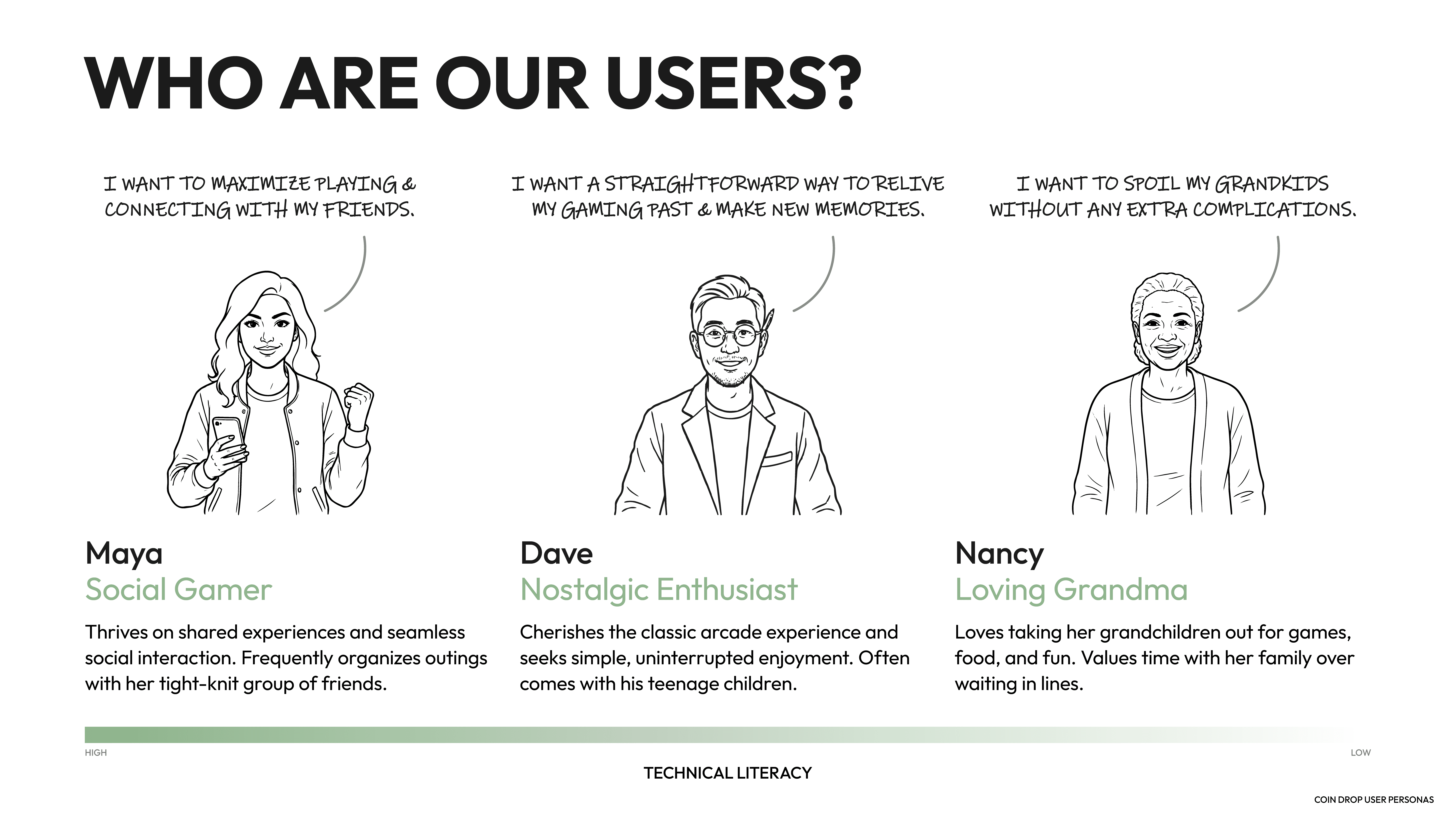
mapping the physical-to-digital journey.
To get a sense of how the app would behave in the real world, we mapped the entire user journey from arrival to cashing out tickets. This gave us a great sense of the places where user sentiment would take a hit due to physical constraints.
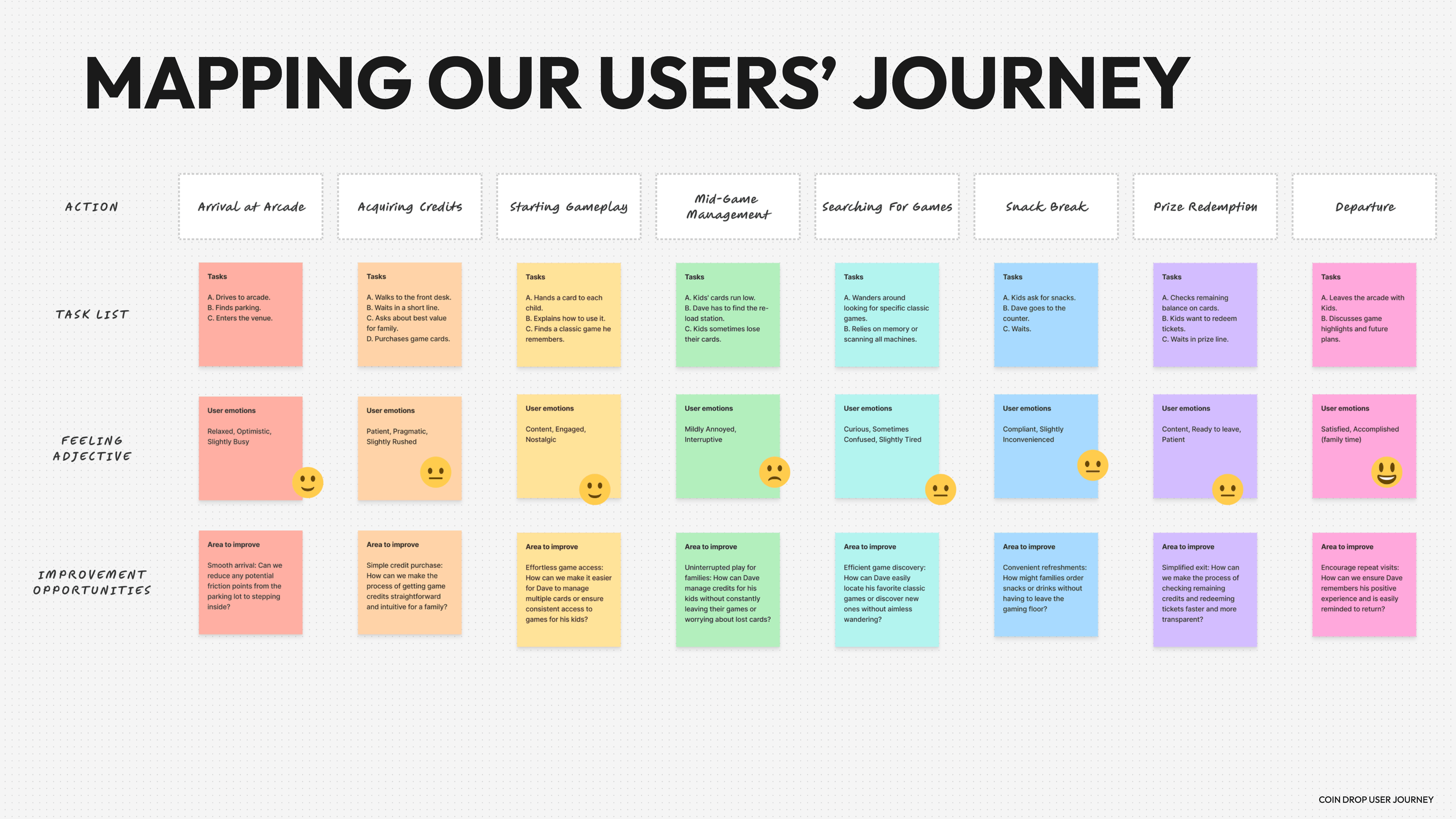
Adding digital touchpoints to the user journey gave us a sense of how we could best intervene:
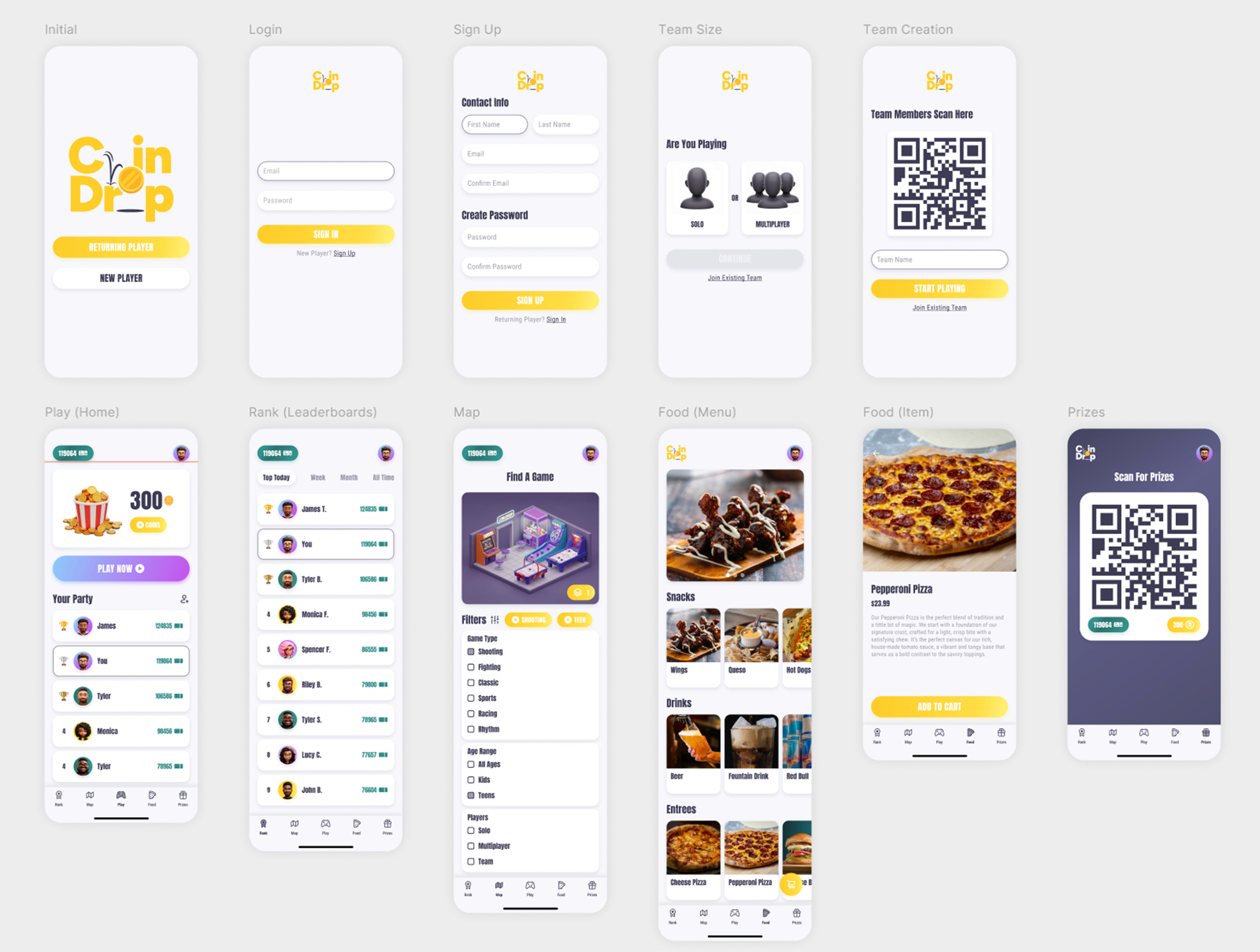
Arrival: skip the front desk line and load a digital game card.
Mid-Game: order a drink to the game cabinet without interrupting the user’s game.
Departure: check digital ticket balance on the way to the prize counter.
defining the mvp.
A companion app can be overwhelming with too many features. With our personas and our user journey map, we could be ruthless in our prioritization exercise and cut any feature that didn’t improve the user experience or remove friction from the user’s path.
We cut the heavy gamification features because the user’s goal is to get in and get some games in, not to be rewarded with digital badges and rewards.
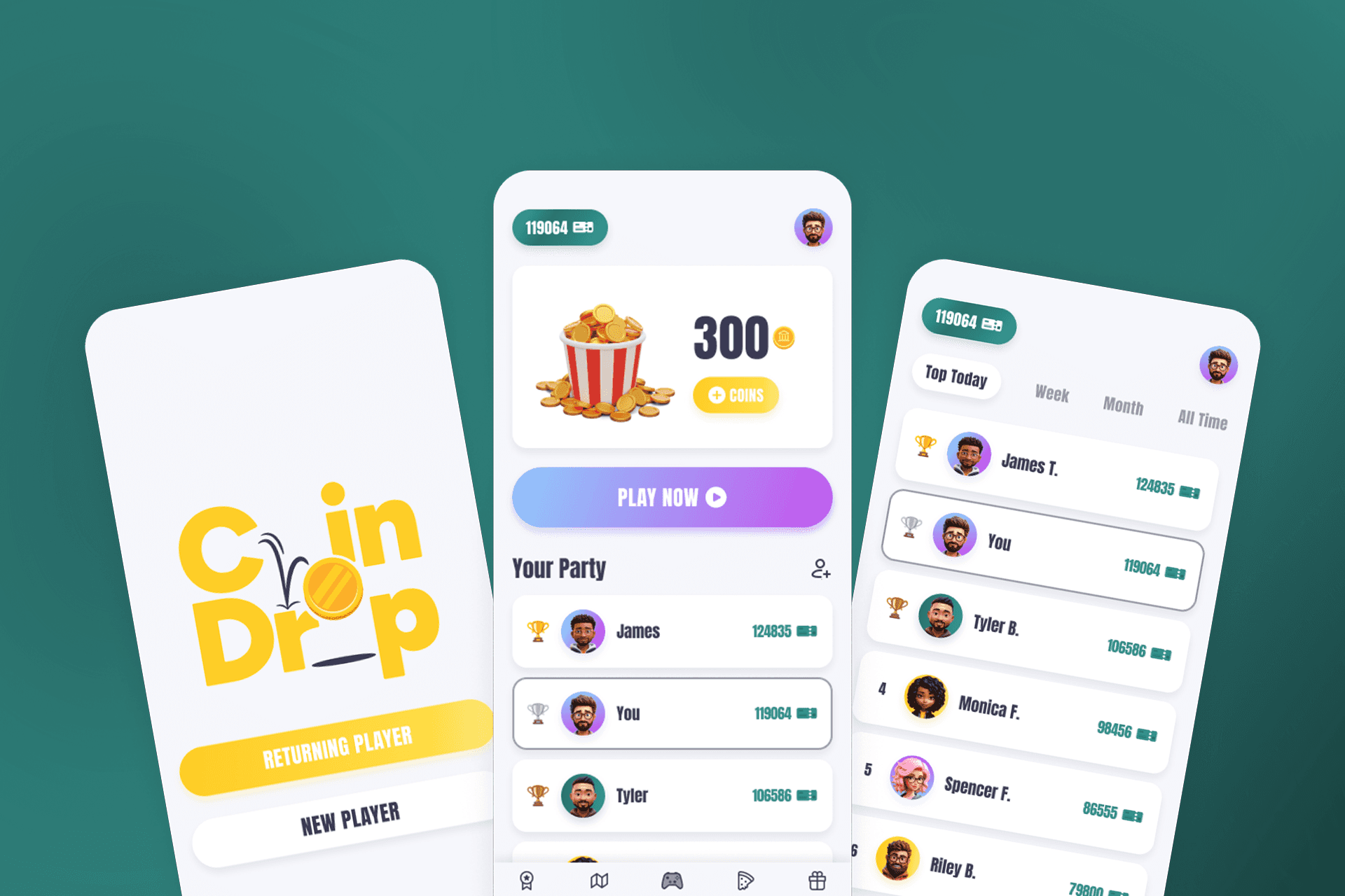
Final MVP feature set:
One-tap digital game card reloads.
Seamless mobile food + beverage ordering.
Real-time ticket tracking + high score logs.
.develop
prototyping for the arcade floor.
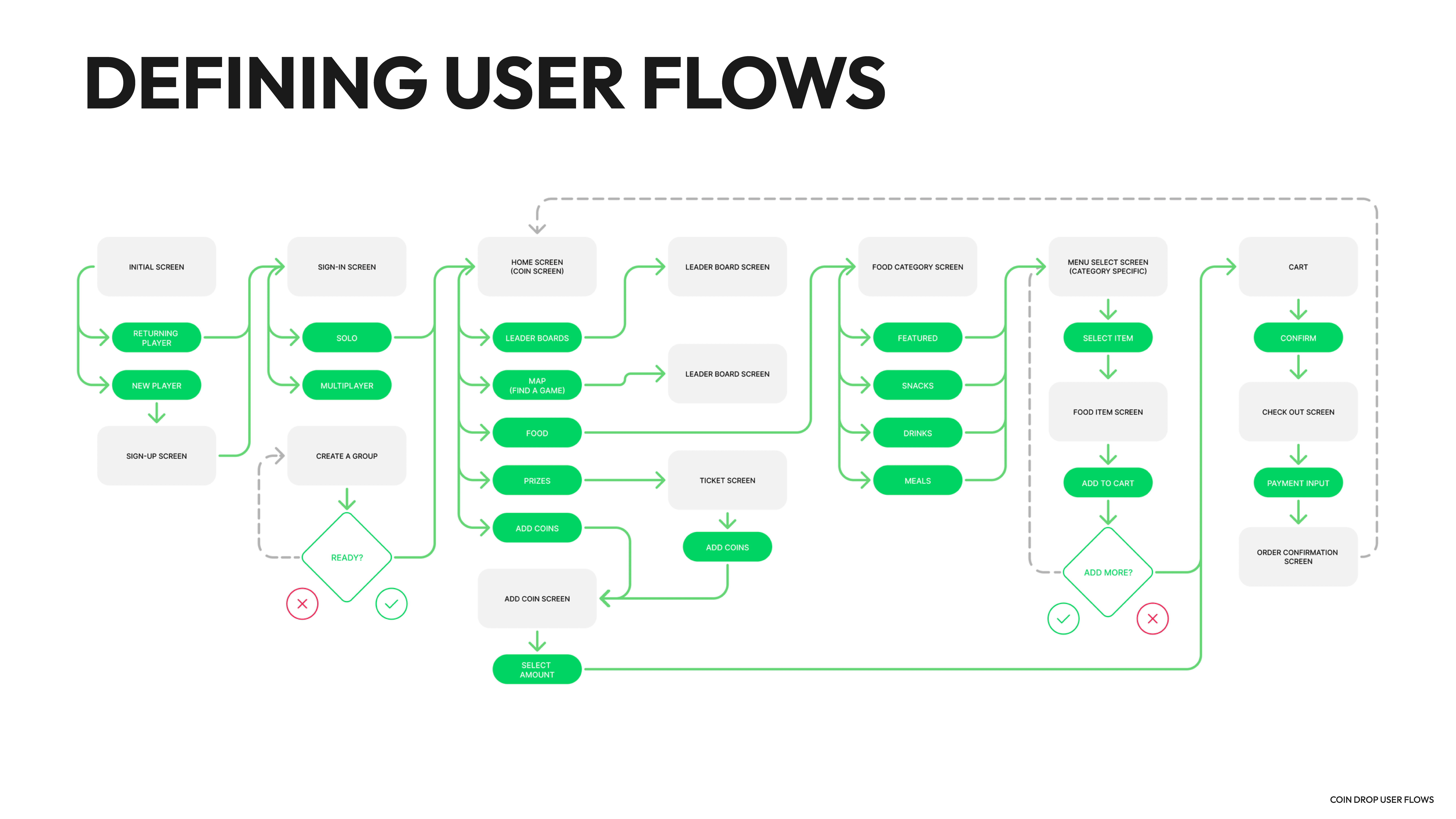
With the guardrails in place, we then designed the structure. This is the Develop phase, where data is translated into physical screens. We wanted absolute simplicity for the arcade floor. So, our design was for a frictionless information architecture before aesthetics.
information architecture + user flows.
A distracted gamer will not have the time or patience for a complex menu system. So, we designed a flat information architecture that exposed the gamer to three key utility options at the start: reload digital game card, order mobile food, and track real-time tickets.
We designed user flows for key tasks to ensure they can be completed in three clicks or less.
lo-fi wireframing.
We used low-fidelity wireframing to solidify the design structure. This is because we wanted to avoid the argument about aesthetics at the low-fidelity phase.
Researching the environment informed our design decisions. So, we designed large bottom sheet navigation and large touch targets to accommodate one-handed usage with a drink or a prize.
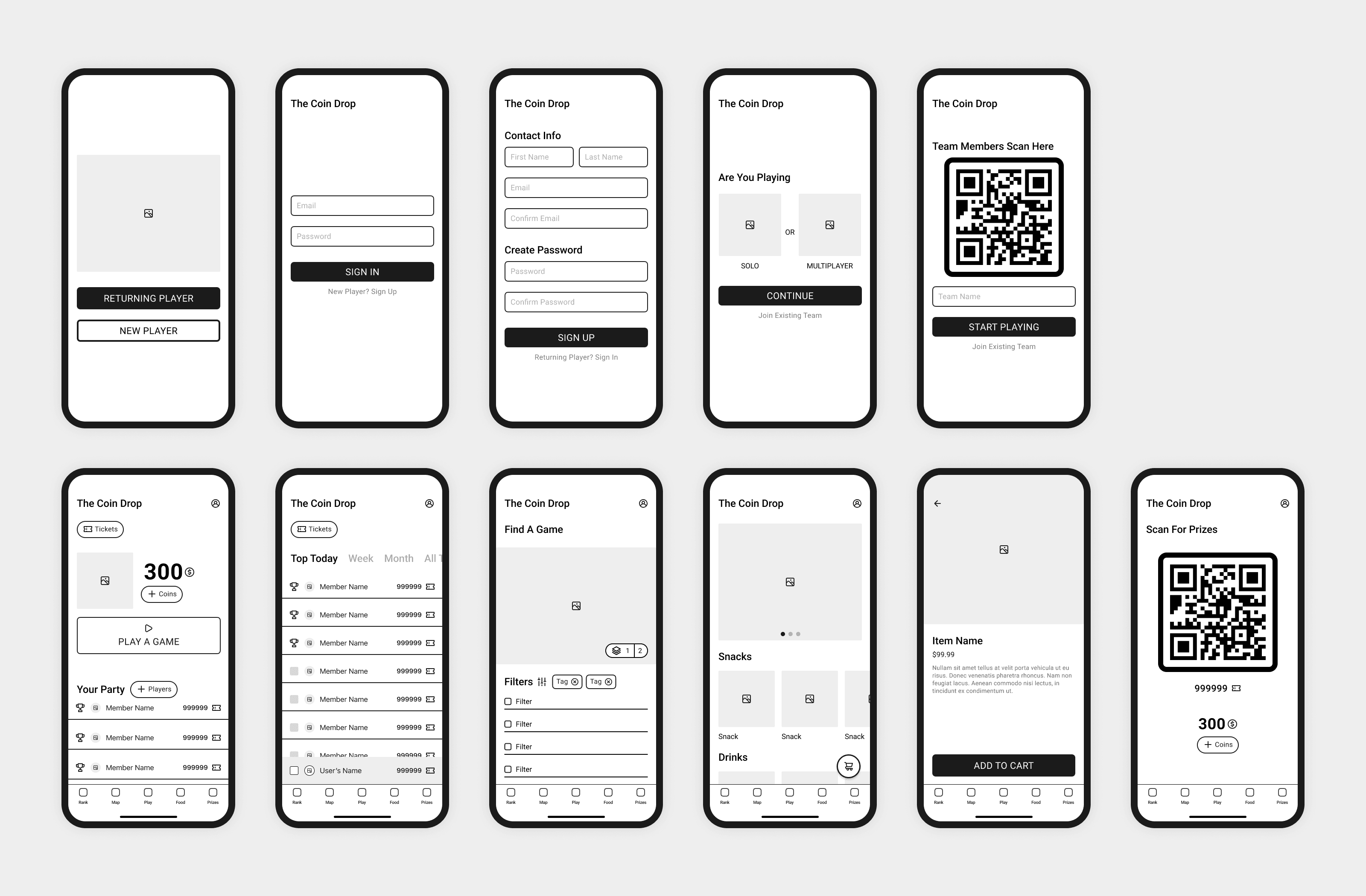
usability testing + iteration.
Just because the wireframe looks good on the calm monitor doesn’t mean it will perform the same in the loud environment. So, we test the interactive low-fidelity design with users to understand where the logic is breaking.

.ideation
Testing revealed that making the 'Add to Party' option difficult to find in account settings led to confusion about how to create groups after onboarding. This was addressed by moving party management from settings and making it easily accessible as a one-tap option on the main dashboard.

.ideation
Players using active game cabinets did not have the patience to scroll vertically through the food and beverage section. This was addressed by making the section tabs stick to the top, allowing users to easily jump to any section without losing their place.
.deliver
hi-fi execution.
With user-validated structure in place, we progressed to the final visual design phase. The bright, noisy environment of the arcade influenced every design decision.
atomic design system.
Prior to any high-fidelity screens, we developed a rich set of components to ensure full application consistency and facilitate the handoff to the developer.

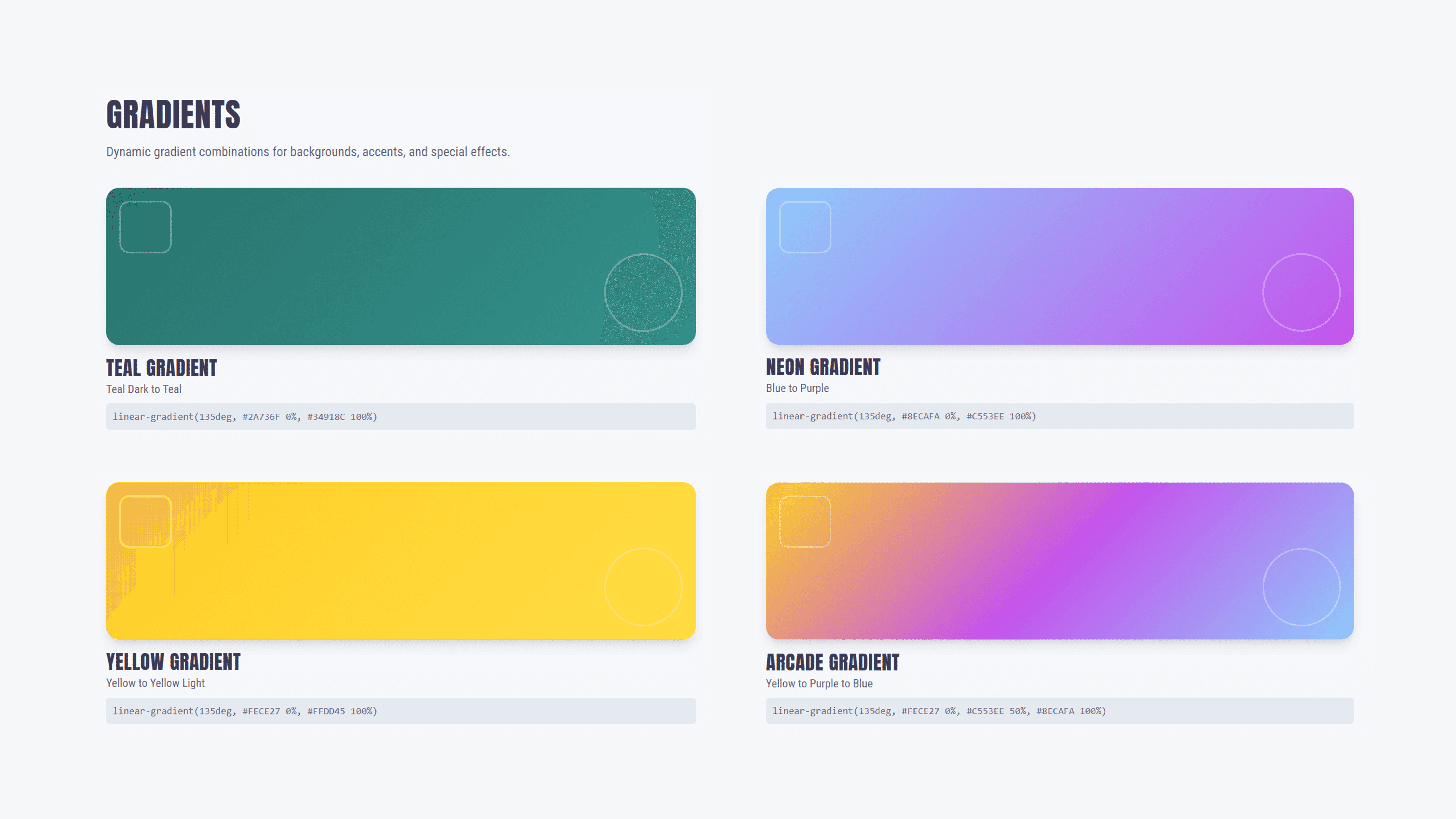
Color Tokens:
Acute backgrounds with rich brand colors direct the user’s focus toward critical actions despite the busy arcade environment.
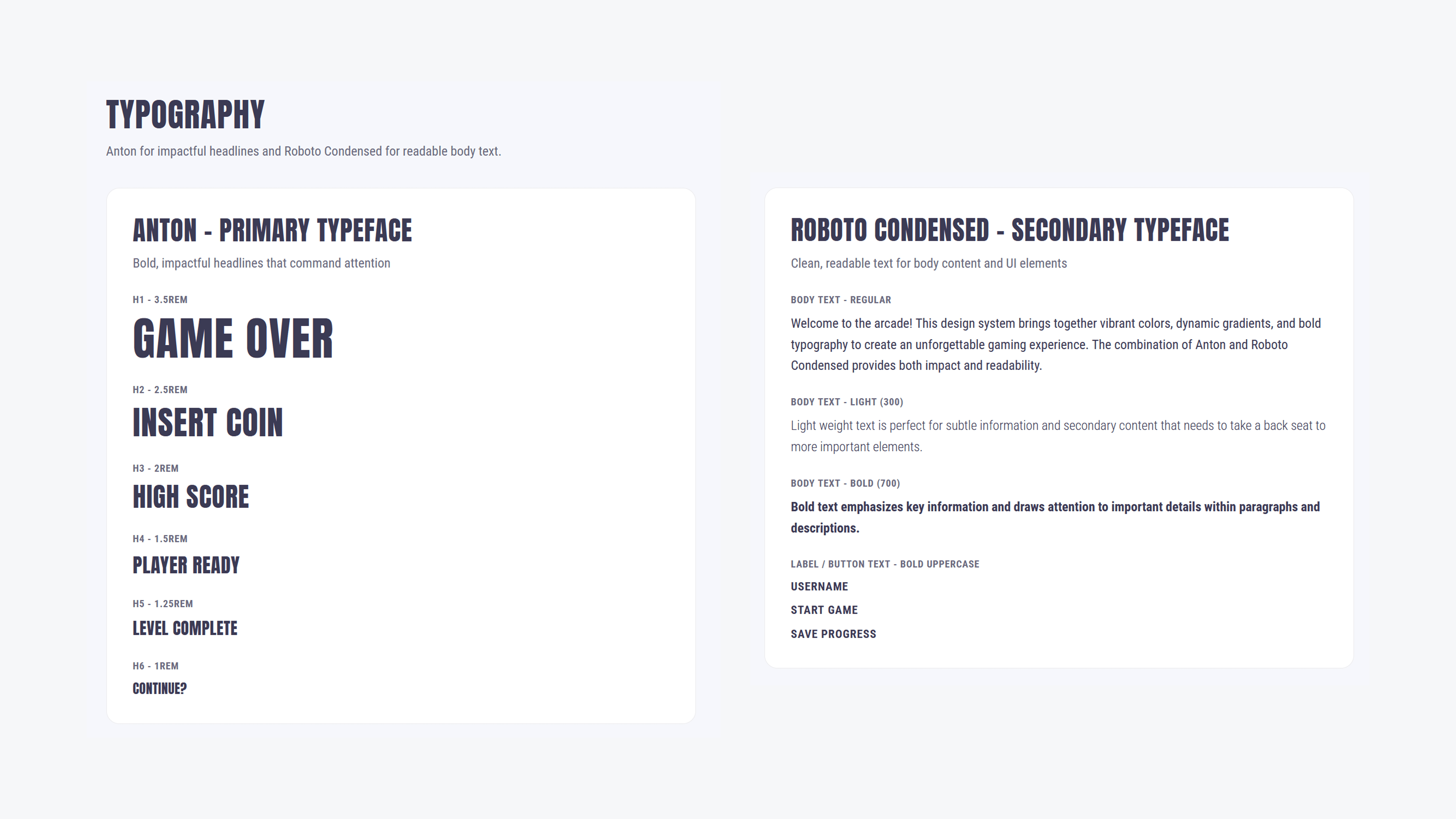
Accessible Typography:
A bold, clear sans-serif type with exact WCAG contrast ratios is easily readable at a glance.
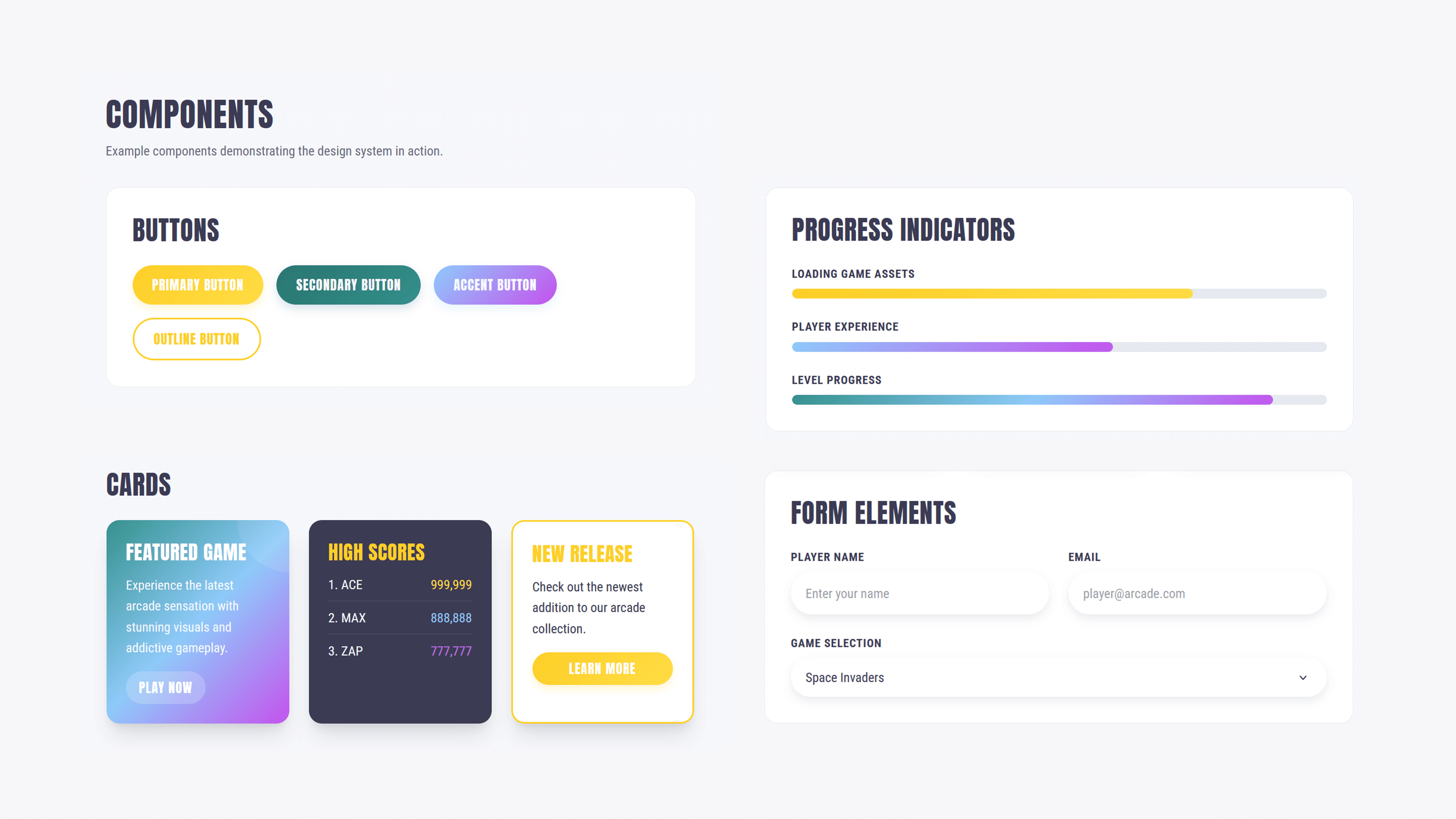
Oversized Touch Targets:
Interactive elements are designed with fast, one-handed thumb interaction in mind.
The Core Experience
We refined our wireframes into beautifully designed, interactive screens that solve the pain points we identified during our observations.

final outcome
The final prototype sought to bridge the gap between a chaotic venue and a streamlined digital utility. By removing unnecessary gamification and focusing on reducing friction, we were able to create an app that keeps players at their games, increases secondary sales, and eliminates kiosk congestion.
.impact
Final Mobile Architecture: The final mobile architecture is that of a digital companion that connects the energetic social scene at the Nashville venue with the digital age. The interface eliminates significant sources of friction, which the arcade can leverage to regain lost revenue due to physical constraints.
Uninterrupted Venue Commerce: A dining and beverage component within the application maintains user engagement on the game floor, minimizing revenue loss during peak hours due to waiting in lines.
Frictionless Group Dynamics: Real-time party management allows users to add and remove friends from the digital party, maximizing playtime and facilitating user interaction in the noisy and busy environment.
Streamlined Play-to-Pay: A digital wallet component replaces the need for cards and tokens, providing the user with the Tap-to-Play experience and minimizing game turnover times.