A Brand Identity Built for the Backcountry.
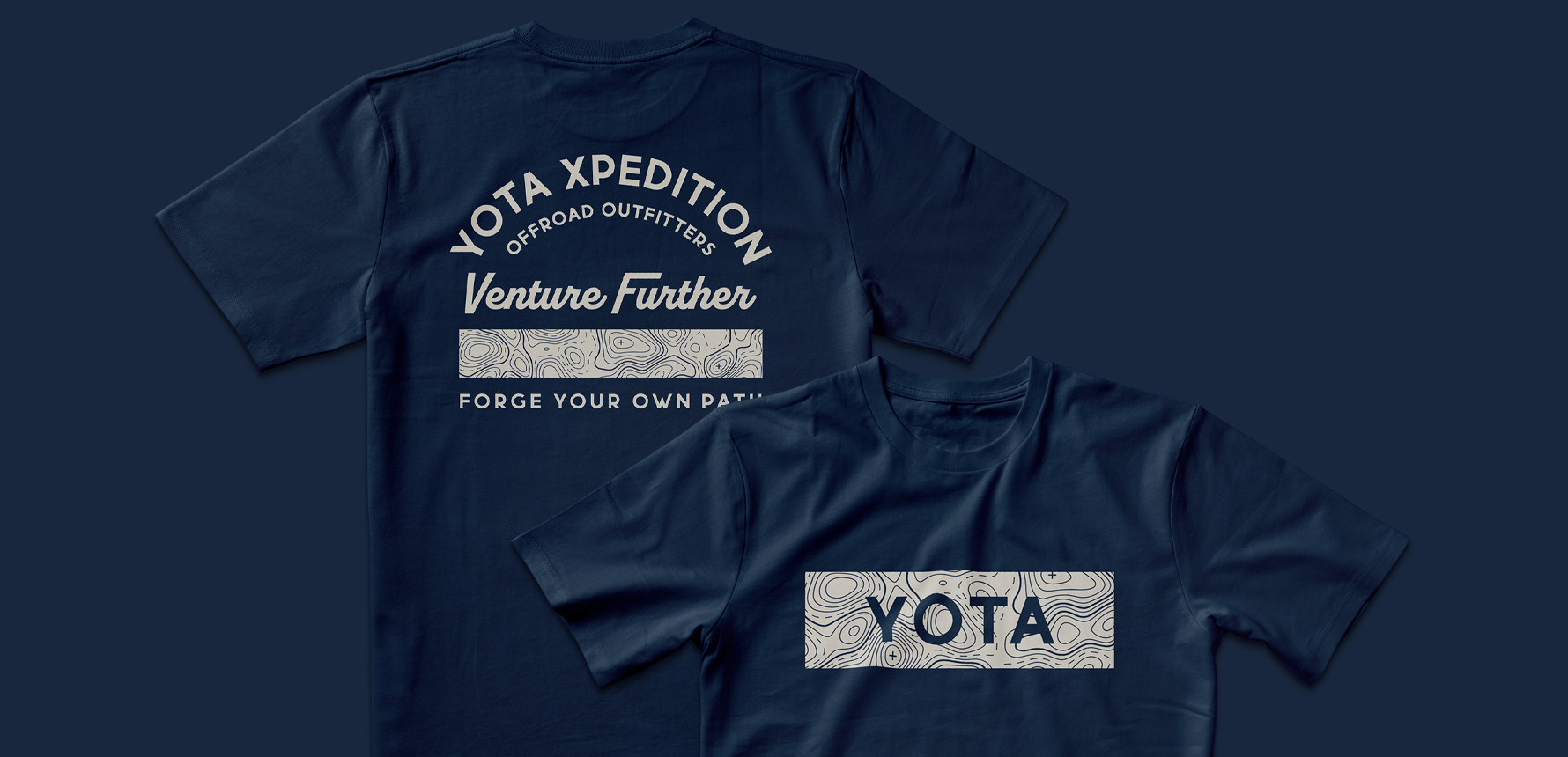
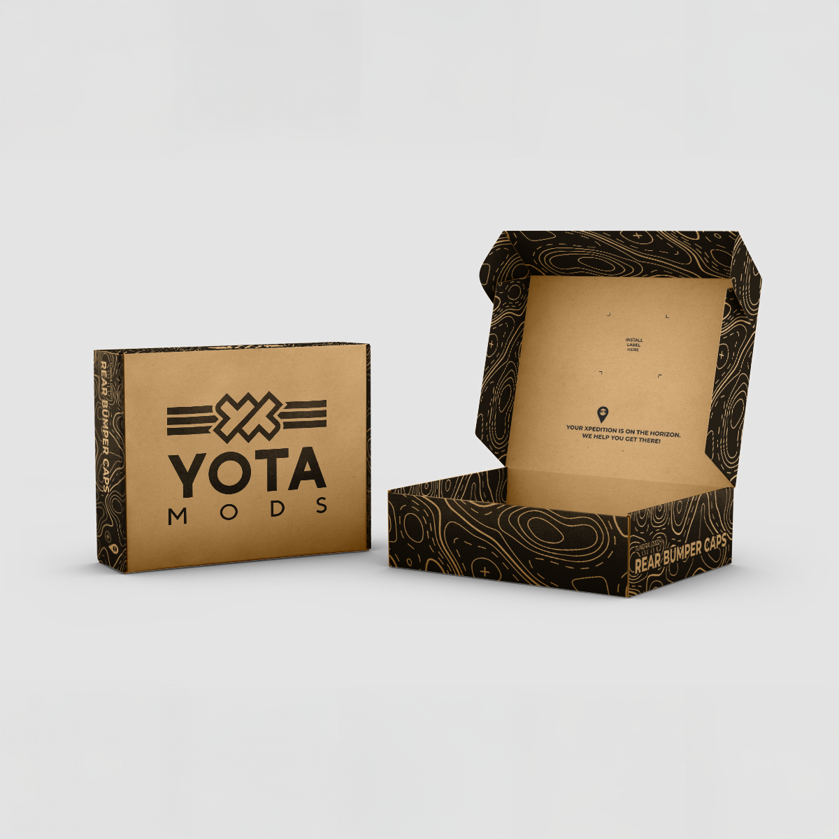
Entering the crowded off-road market requires more than just good parts; it requires a brand that speaks the language of the trail. The heart of Yota Xpedition is exploration, and the goal of this project was to translate that passion into a tangible design system.
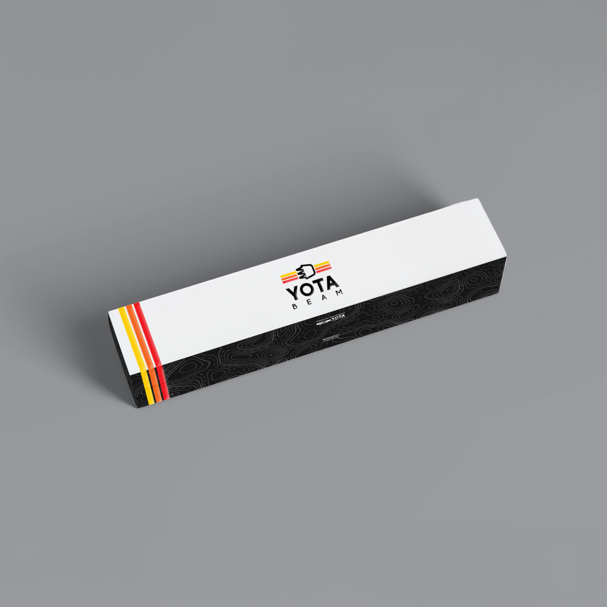
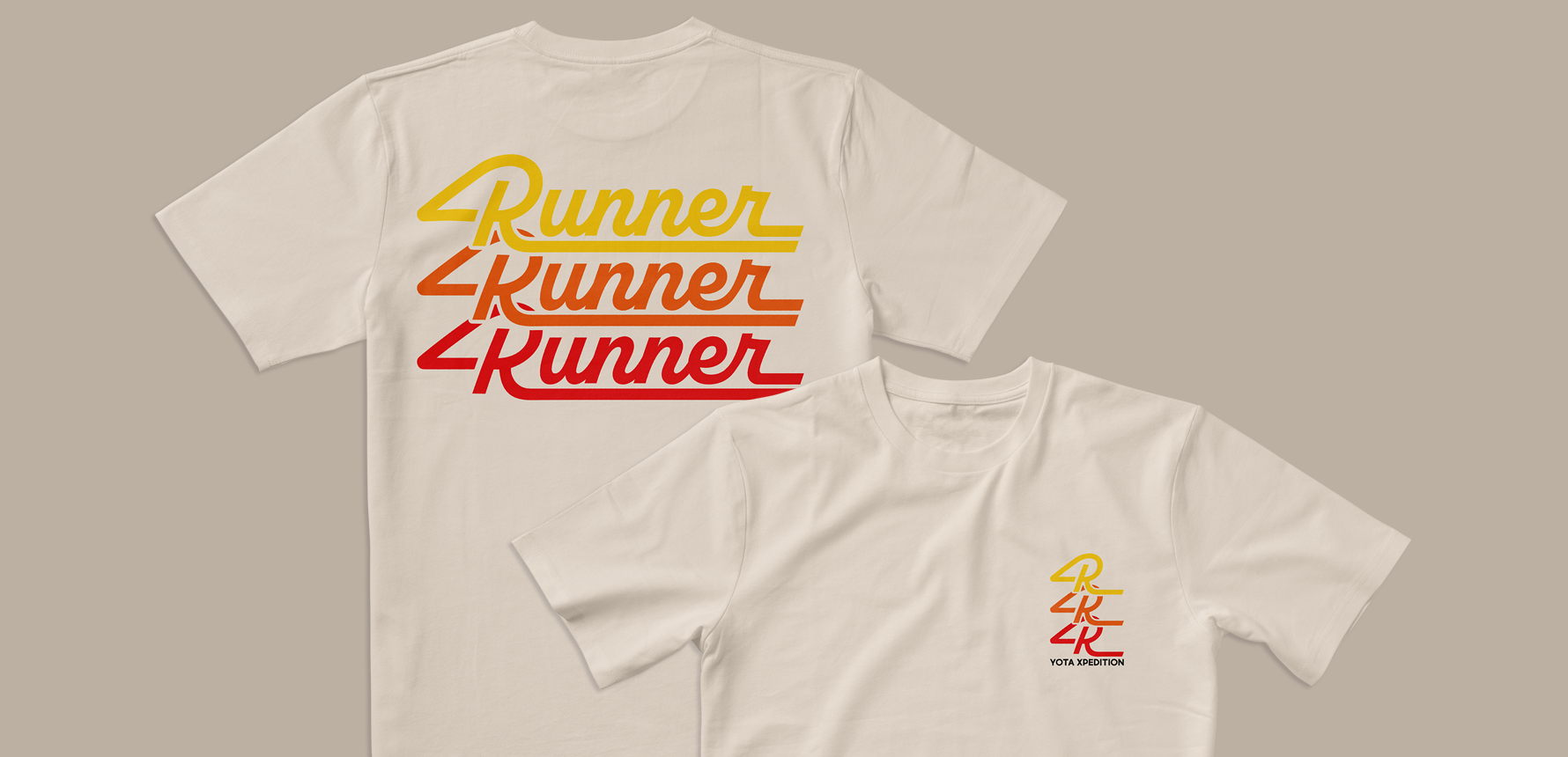
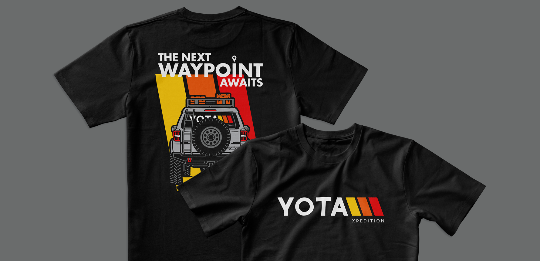
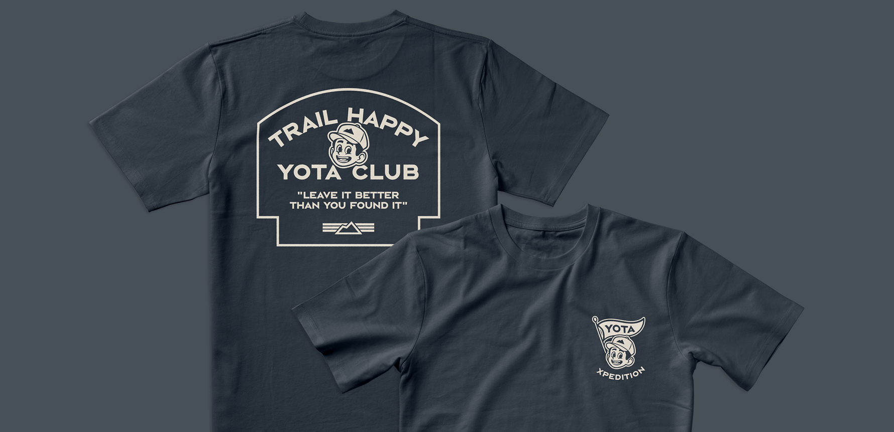
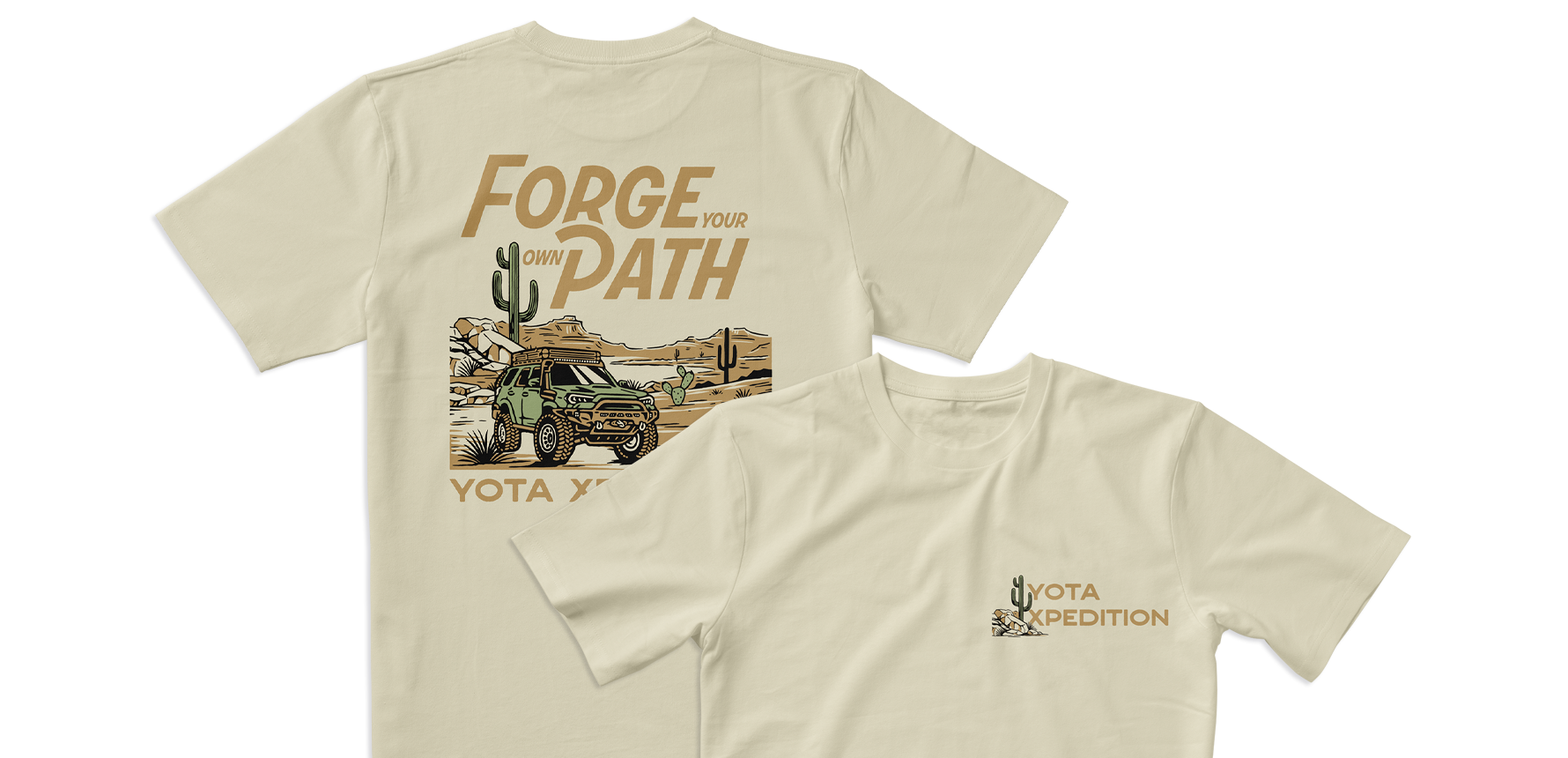
This collaboration focused on building out the brand’s ecosystem through distinct sub-brand logos, tactile packaging experiences, and lifestyle merchandise. The result is a visual identity that feels technical yet approachable, elevating Yota Xpedition’s presence from the garage to the great outdoors.
