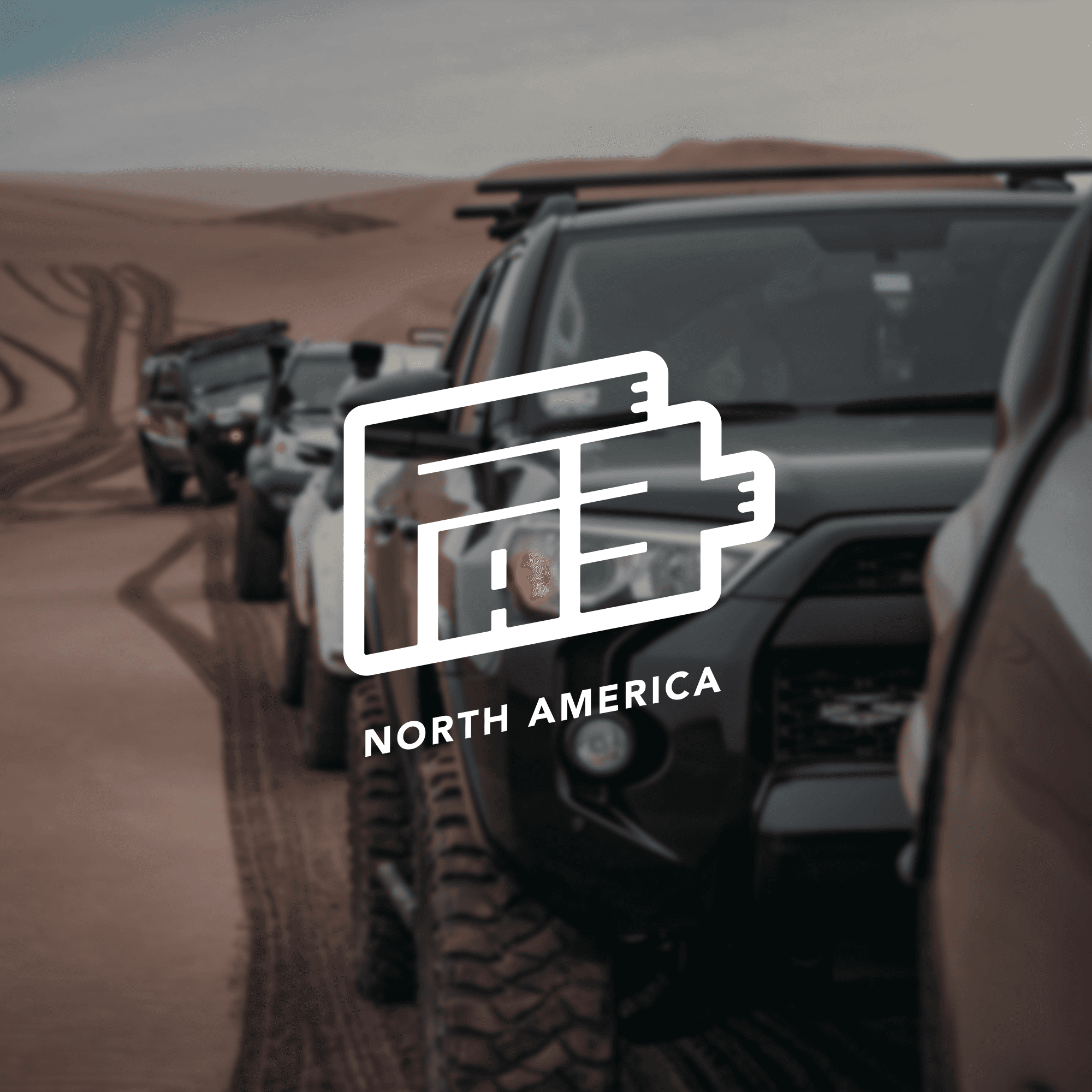
yota xpedition
a trail-ready apparel line designed specifically for the off-road and overlanding community.
00
problem
As Yota Xpedition's audience grew, they recognized a clear gap in the overlanding market: most off-road apparel relied on saturated, cliché tropes. The brand needed a visual merchandise system that captured the rugged, authentic spirit of modern vehicle-based adventure without looking cheap or overly aggressive.
solution
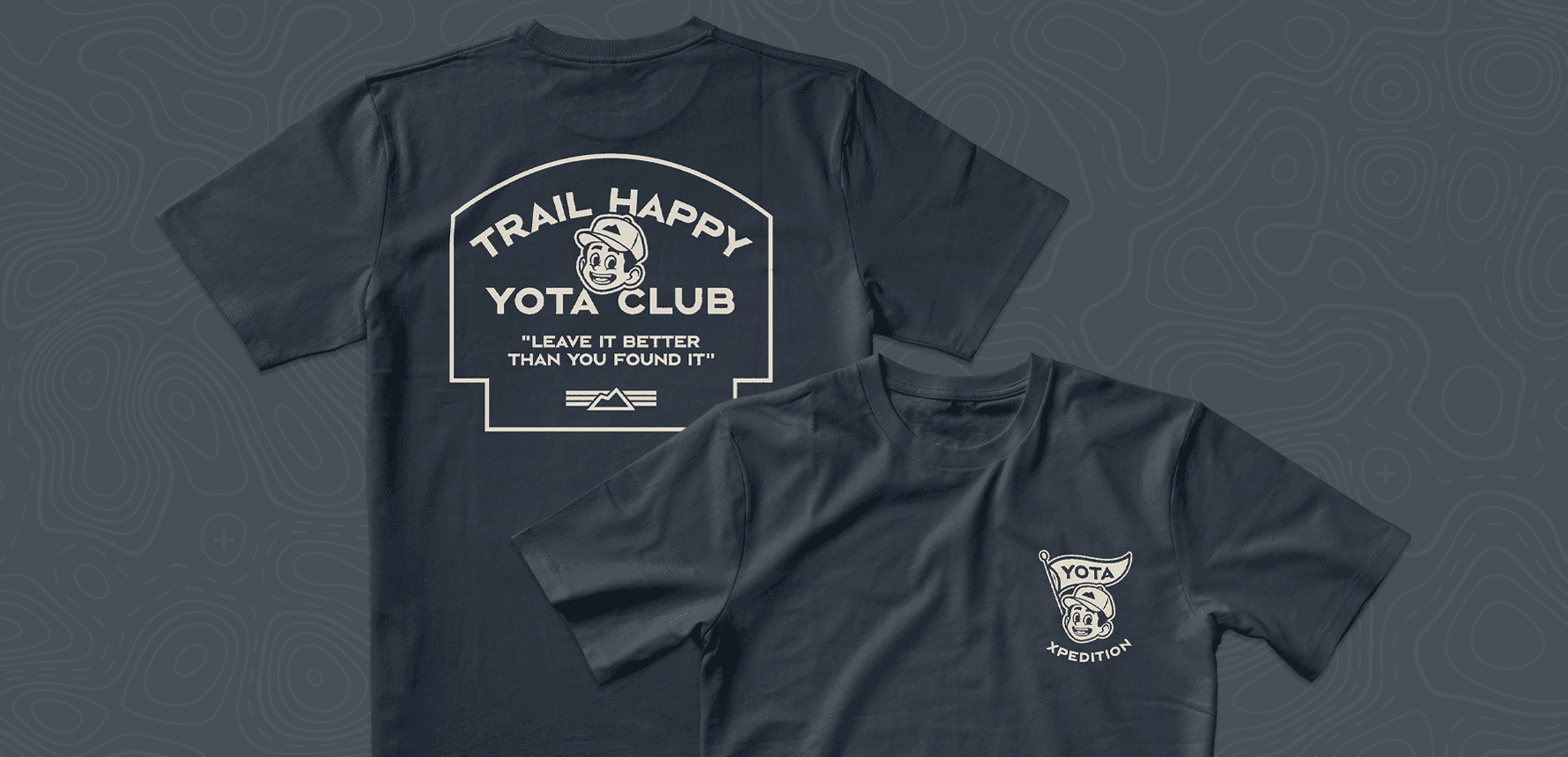
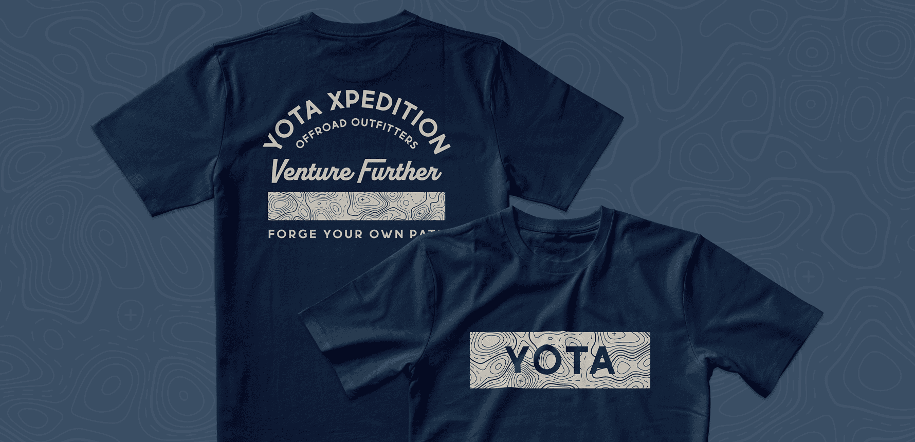
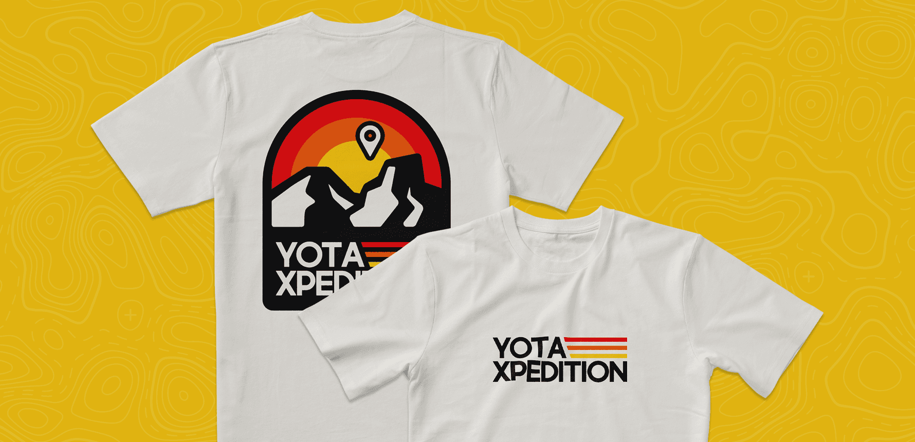
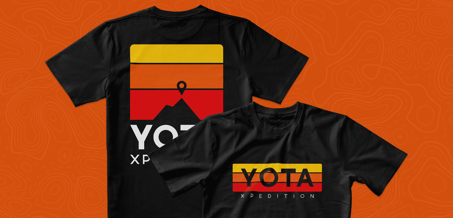
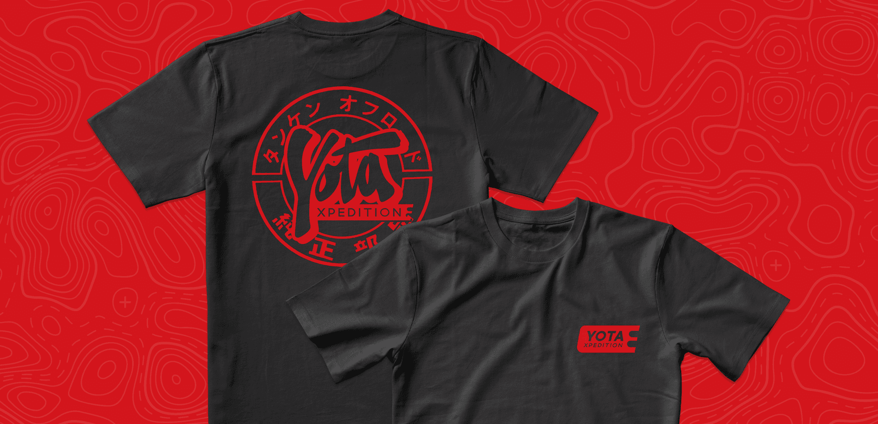
I partnered with Yota Xpedition to engineer a cohesive, trail-ready apparel collection. By introducing custom typography and durable, expedition-inspired graphics, we added to their merchandise line. We created authentic lifestyle gear that the overlanding community was proud to wear both on and off the trail.
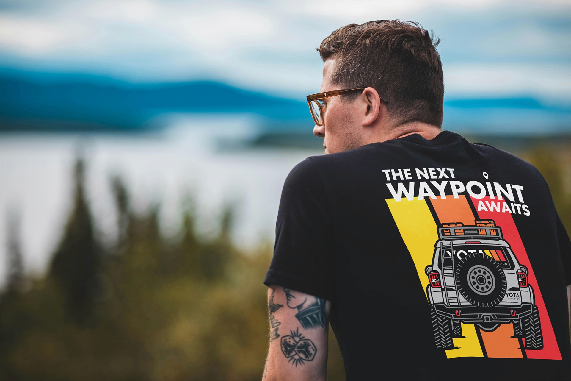
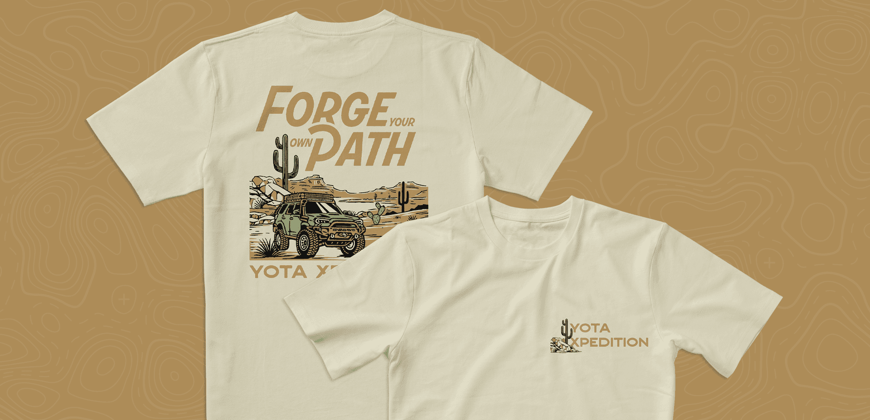
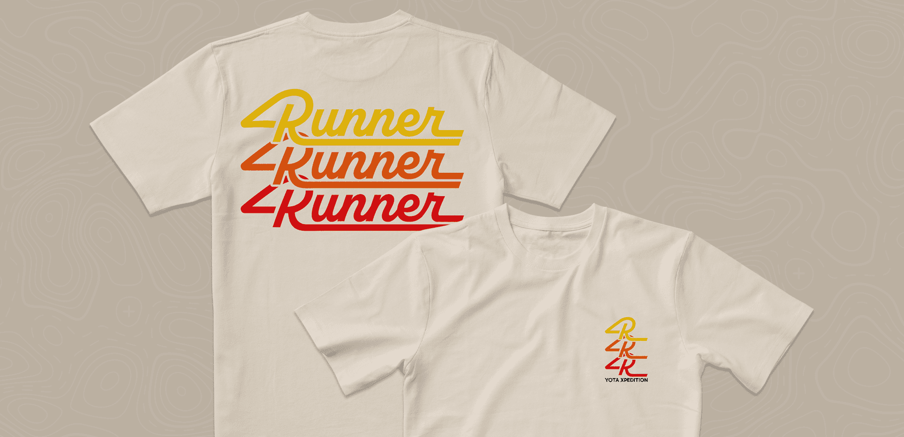
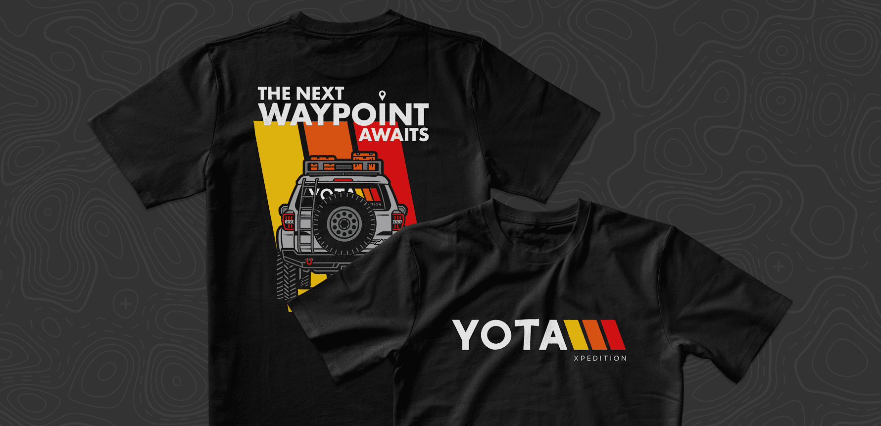
The catalyst for this apparel collection was a high-stakes promotional event: a fully-built Toyota 4Runner giveaway. Because giveaway entries were tied directly to storefront purchases, we needed to introduce a fresh lineup of merchandise that served as a highly desirable, low-barrier entry point for the community. Recognizing that participants entering a 4Runner giveaway would naturally gravitate toward vehicle-specific gear, we strategically anchored the collection around bespoke 4Runner illustrations. However, to ensure the line had longevity and broad appeal across their entire customer base of Toyota truck owners, we balanced the release with several core, brand-centric designs. After exploring a wide range of concepts, we refined the collection down to eight final, purpose-built graphics.
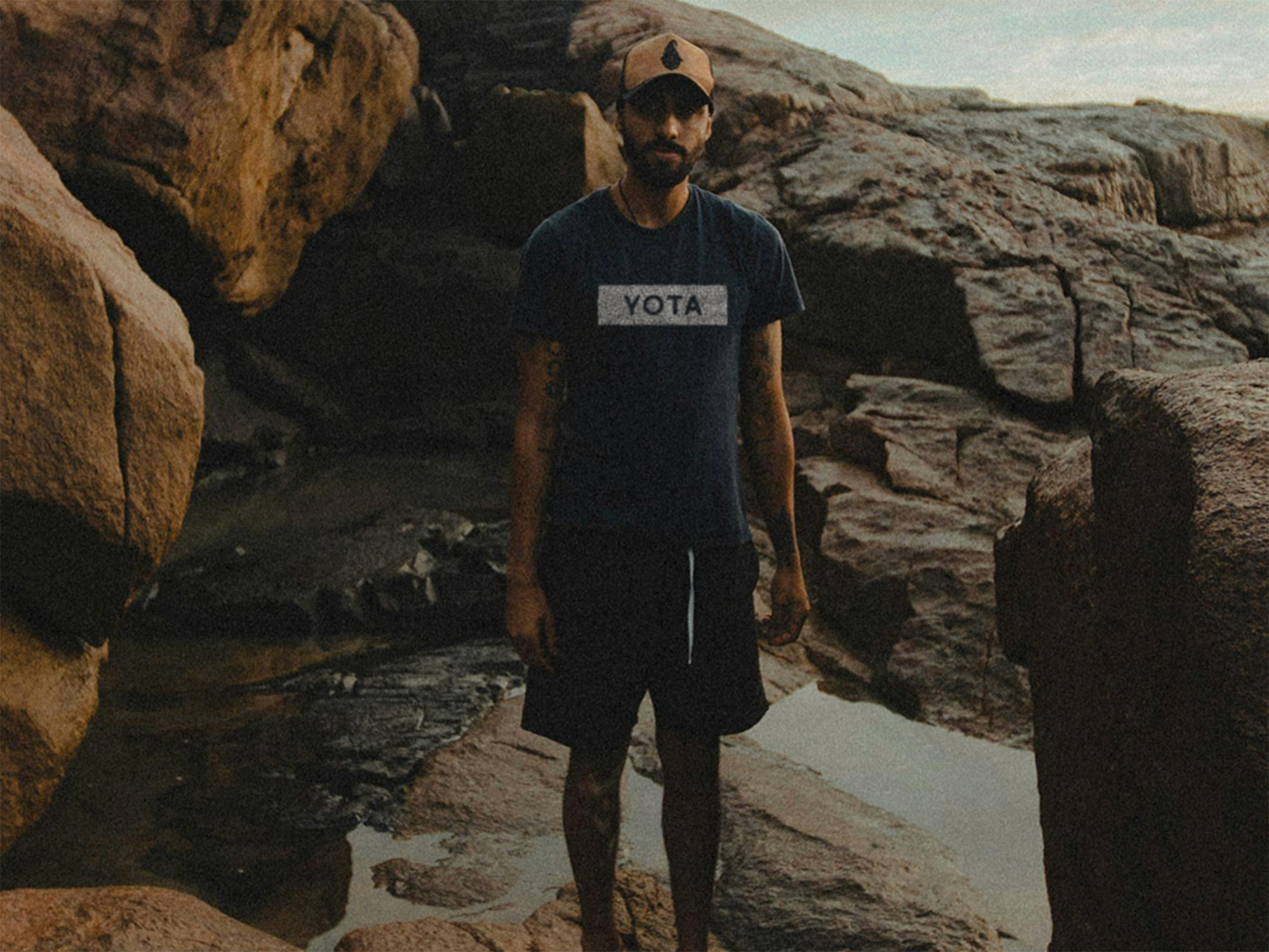
With the artwork locked in, the focus shifted entirely to the physical execution to ensure the gear met the premium standards of the overlanding community. I curated a specific selection of shirt blanks for the client, evaluating different weights, colorways, and premium brands that could withstand the wear and tear of the trail. Once the physical garments were selected, I initiated a meticulous color-mapping process… painstakingly adjusting the digital ink profiles and color values of the designs to harmonize perfectly with the specific dye lots of the chosen blanks. This ensured the final printed products felt cohesive and intentional in the real world.
constraints
Strict Promotional Timeline: The entire collection was driven by a high-stakes 4Runner giveaway with a hard launch date. All artwork had to be finalized, color-mapped, and delivered to the printer before the campaign went live to ensure the physical stock was either ready to ship or available for immediate pre-order.
Preserving Brand Equity: While the new merchandise line allowed for some creative exploration, every piece had to unmistakably "feel" like Yota Xpedition. The challenge was balancing fresh, highly desirable 4Runner graphics with the rugged, established visual identity of the broader brand.
Premium Feel vs. Margins: Because these items were low-barrier entry methods for the giveaway, they needed to feel high-end without destroying the campaign's profit margins. I solved this by strategically sourcing Comfort Colors and AS Colour blanks, utilizing their dark and neutral colorways to achieve a premium, tactical feel at a manageable unit cost.
Color Mapping: Relying purely on black and white ink is the safe route, but we wanted to elevate the collection with distinct accent colors. This required a meticulous color-matching process to ensure the digital ink profiles felt cohesive, rather than clashing or washing out against the specific dye of the neutral garment blanks.
01
02
03
04
05
06
07
08
impact
While specific revenue and conversion metrics remain proprietary to the client, the market reception of the new merchandise line was immediate and highly visible.
Rapid Inventory Depletion: Serving as the low-barrier entry point for the 4Runner giveaway campaign, the apparel successfully drove massive engagement. Multiple styles across the new collection sold out rapidly shortly after the promotional launch.
Top-Performing SKUs: By monitoring the storefront's native sorting data, several of the newly introduced designs quickly bypassed legacy items to dominate the site's "Best Selling" category, proving the updated aesthetic resonated with the overlanding community.
Ongoing Partnership: The true measure of this project's success was the trust it built. Delivering a premium, profitable collection on a strict timeline transitioned Blue + Yellow Design Co. from a one-off vendor into a trusted design partner, leading directly to a continuous relationship and multiple subsequent projects for the Yota Xpedition brand.