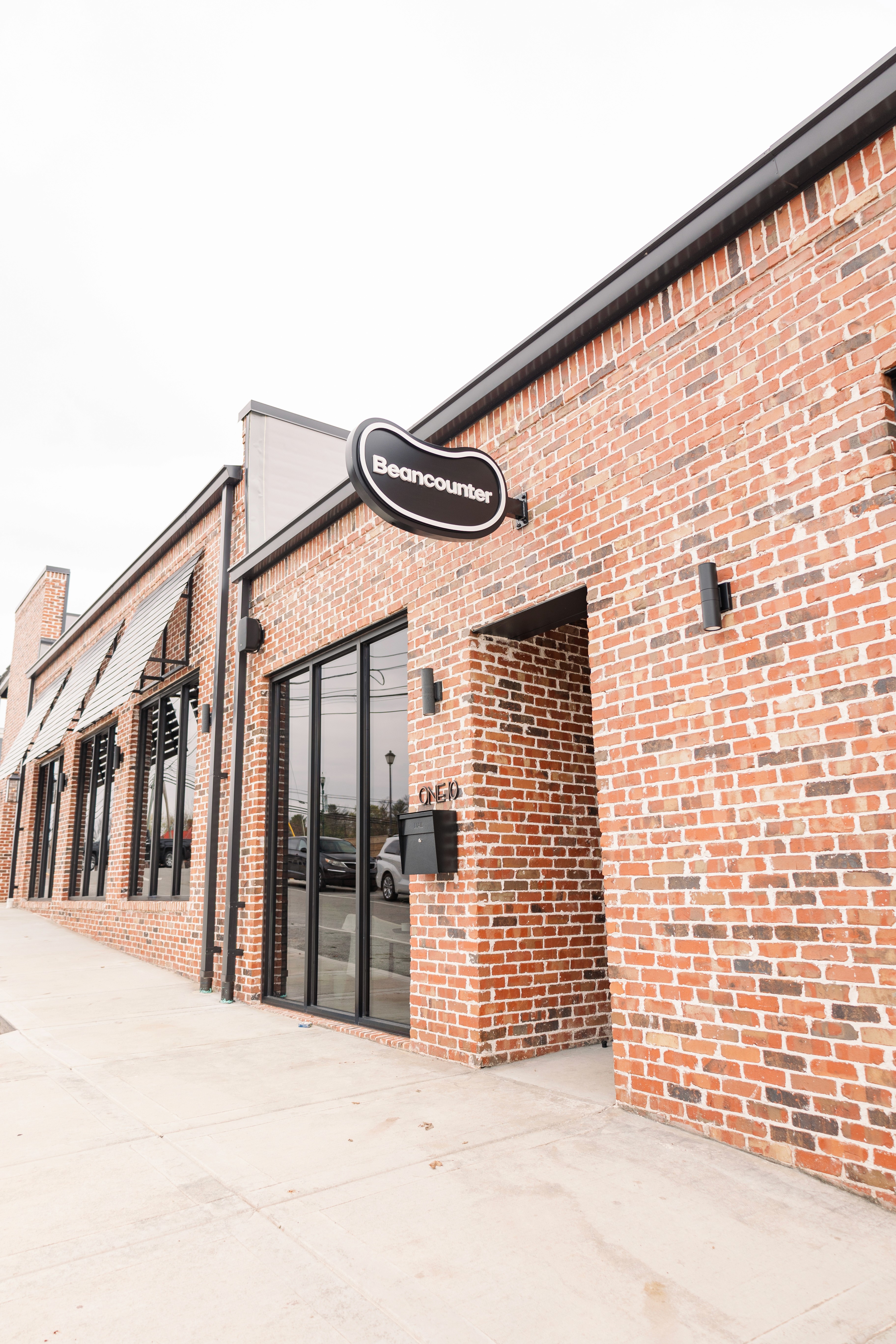
beancounter
a modern brand identity that trades traditional corporate accounting for approachable personality.
00
problem
The accounting industry is historically saturated with rigid corporate branding and stuffy visual identities. Beancounter had already flipped the script internally by offering a friendly, down-to-earth approach for small businesses in Kentucky. However, their existing visual identity failed to reflect this approachable personality. This created a disconnect between their vibrant internal culture and their outward appearance, and they needed a visual update that matched their modern approach to financial services.
solution
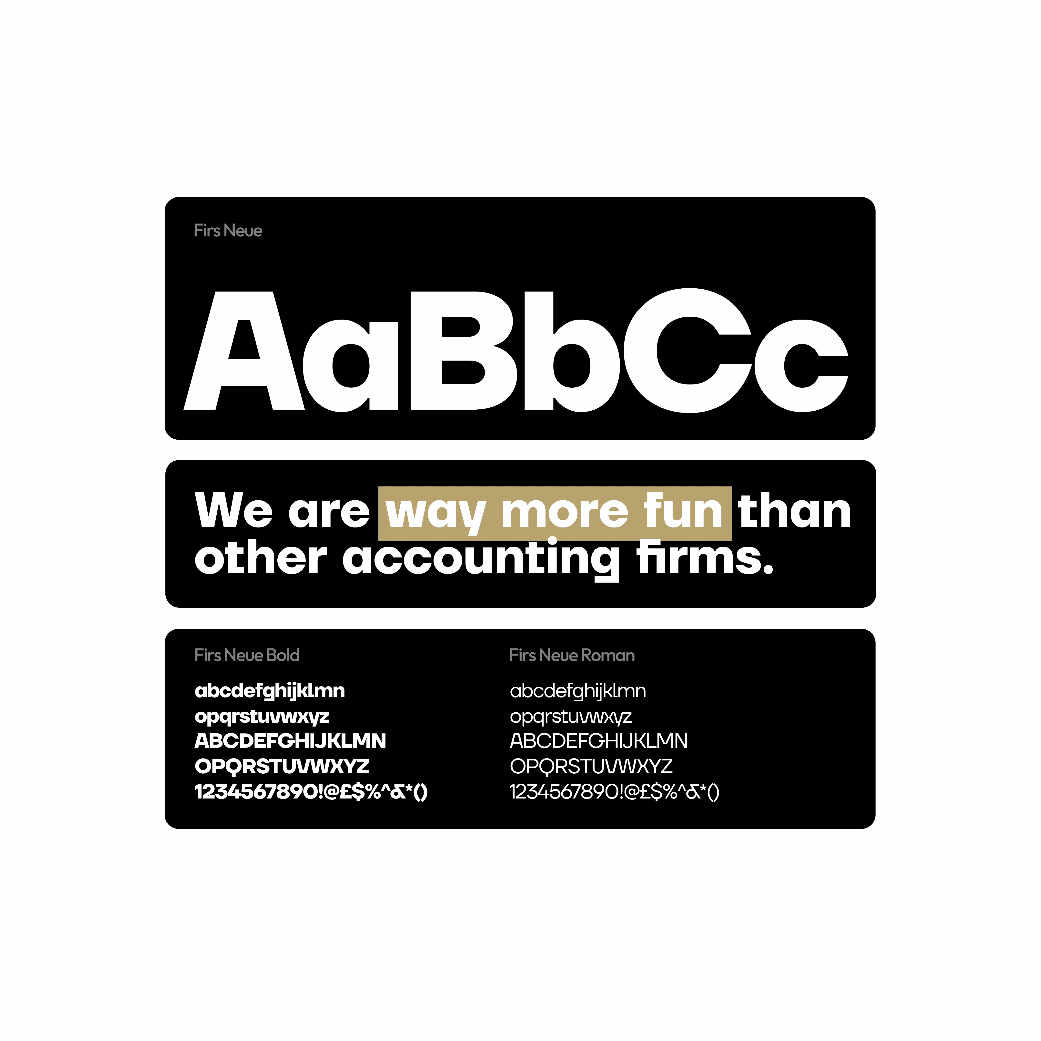
We executed a rapid 14-day brand refresh to realign their visual identity with their core values. By streamlining their existing logo, introducing a custom typeface, and injecting a modernized color palette, we traded traditional corporate aesthetics for an approachable personality. To ensure immediate usability, we translated this refreshed identity into a flexible toolkit of alternative lockups, document layouts, and business cards.
The term "beancounter" traditionally refers to a meticulous, obsessive record-keeper. The team at Beancounter embraced the precision of the name but completely rejected the stuffy corporate culture that usually accompanies it. They built a firm focused on empowering small businesses through friendly, tailored financial coaching. The challenge for Blue + Yellow Design Co. was capturing that unique juxtaposition visually. We needed to retain their established brand equity while injecting the warmth and approachability they were known for locally.
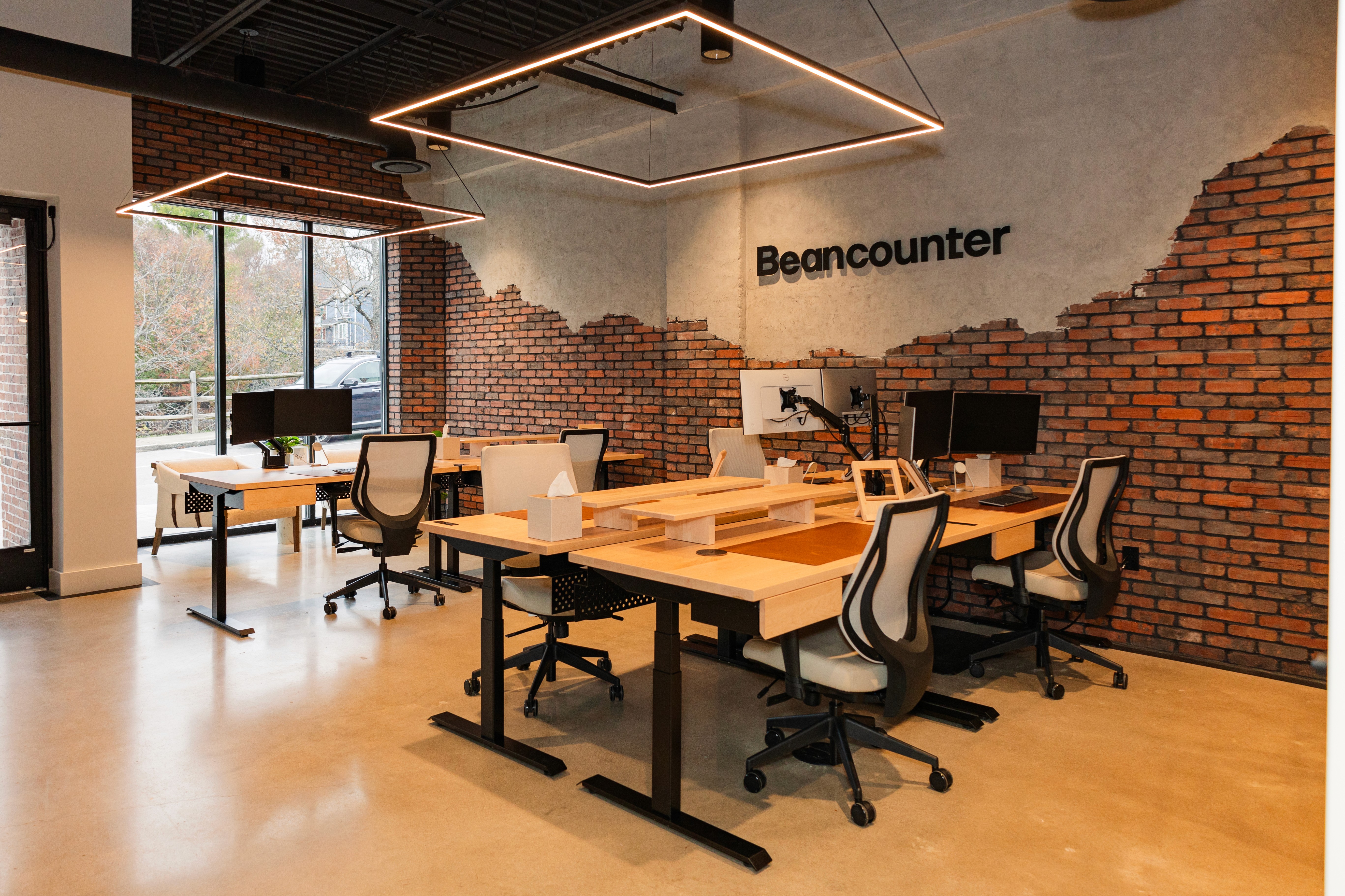
Because the timeline was a strict 14-day sprint, a ground-up redesign was not the objective. Instead, we focused on a high-impact brand refresh. We collaborated closely with their team to streamline the existing logo for a cleaner, contemporary look. We paired this updated mark with a new custom typeface and a modernized color palette that perfectly balanced professional trust with an inviting, human personality.

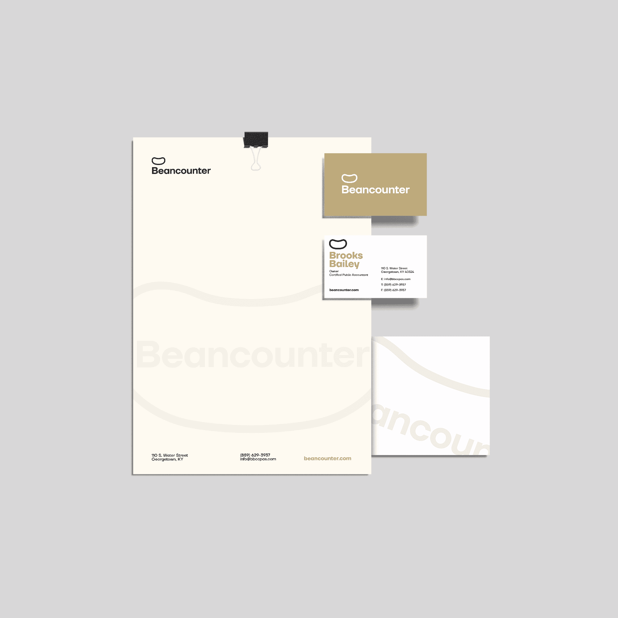
To ensure the Beancounter team could immediately leverage their new look, we expanded the core identity into a robust set of practical assets. We developed several alternative logo lockups to provide flexibility across both digital and print applications. Finally, we designed cohesive document page layouts and business cards. This provided their team with a polished, plug-and-play toolkit that perfectly matched their disruptive approach to accounting.
year
2024
timeframe
14 days
tools
Illustrator InDesign
category
Branding + Identity
constraints
14-Day Timeline: A strict two-week turnaround for a brand identity update left absolutely zero room for scope creep. Every phase of the project had to be tightly boxed and executed without delay.
Restraint Over Reinvention: Because this was a refresh rather than a ground up redesign, the core constraint was resisting the urge to completely scrap the old identity. We had to carefully extract the recognizable elements of their original logo and modernize them to ensure their existing local client base still recognized the brand.
01

02
03
impact
Immediate Brand Alignment: The modernized logo and injected color palette instantly bridged the gap between their friendly, down-to-earth internal culture and their public-facing presence.
A Ready-to-Use Toolkit: By delivering comprehensive document layouts, business cards, and alternative logo lockups, the Beancounter team was fully empowered to produce consistent, highly professional materials on day one without needing ongoing design support.
Market Differentiation: The updated visual identity successfully positioned the firm as an approachable, human alternative within a historically rigid and stuffy financial sector.