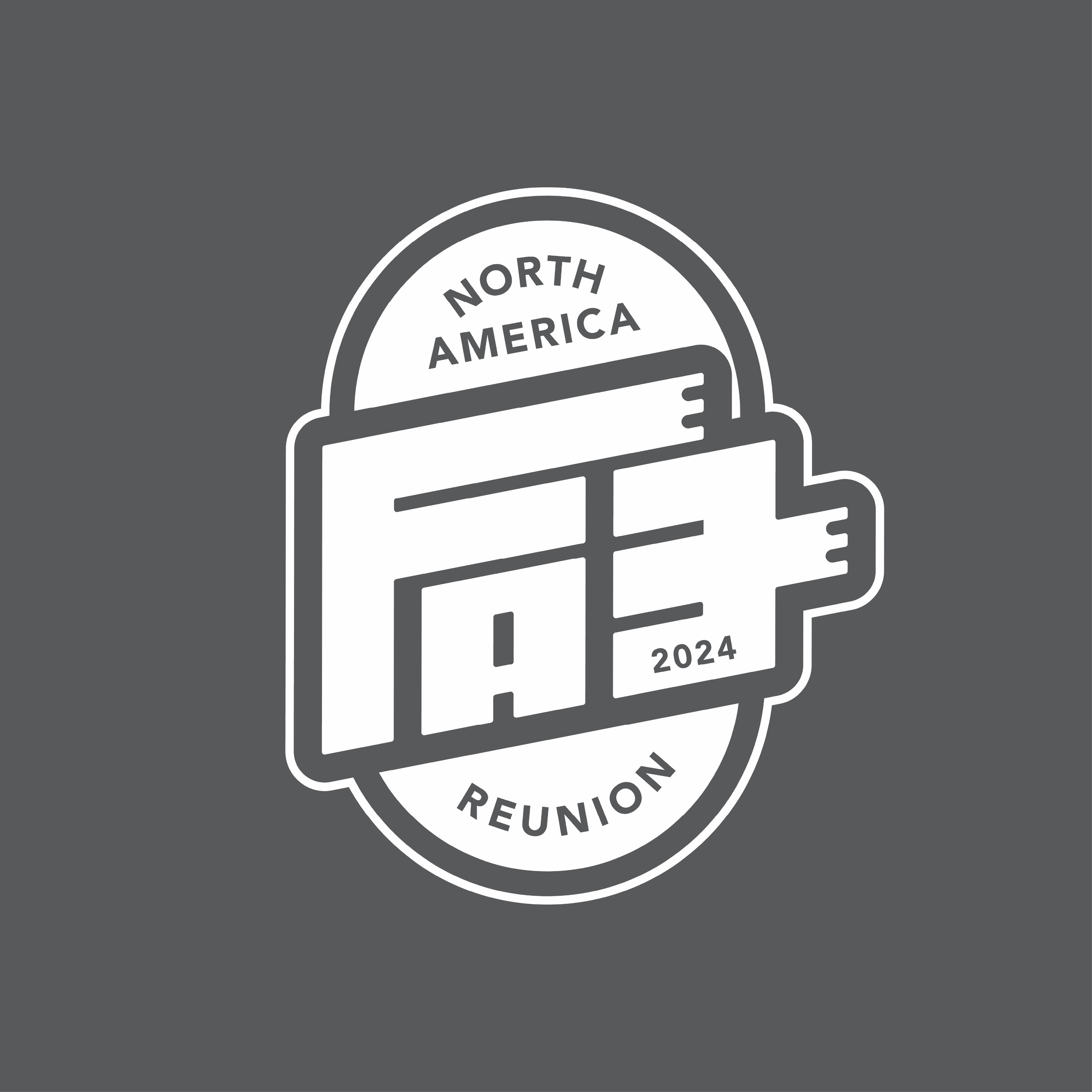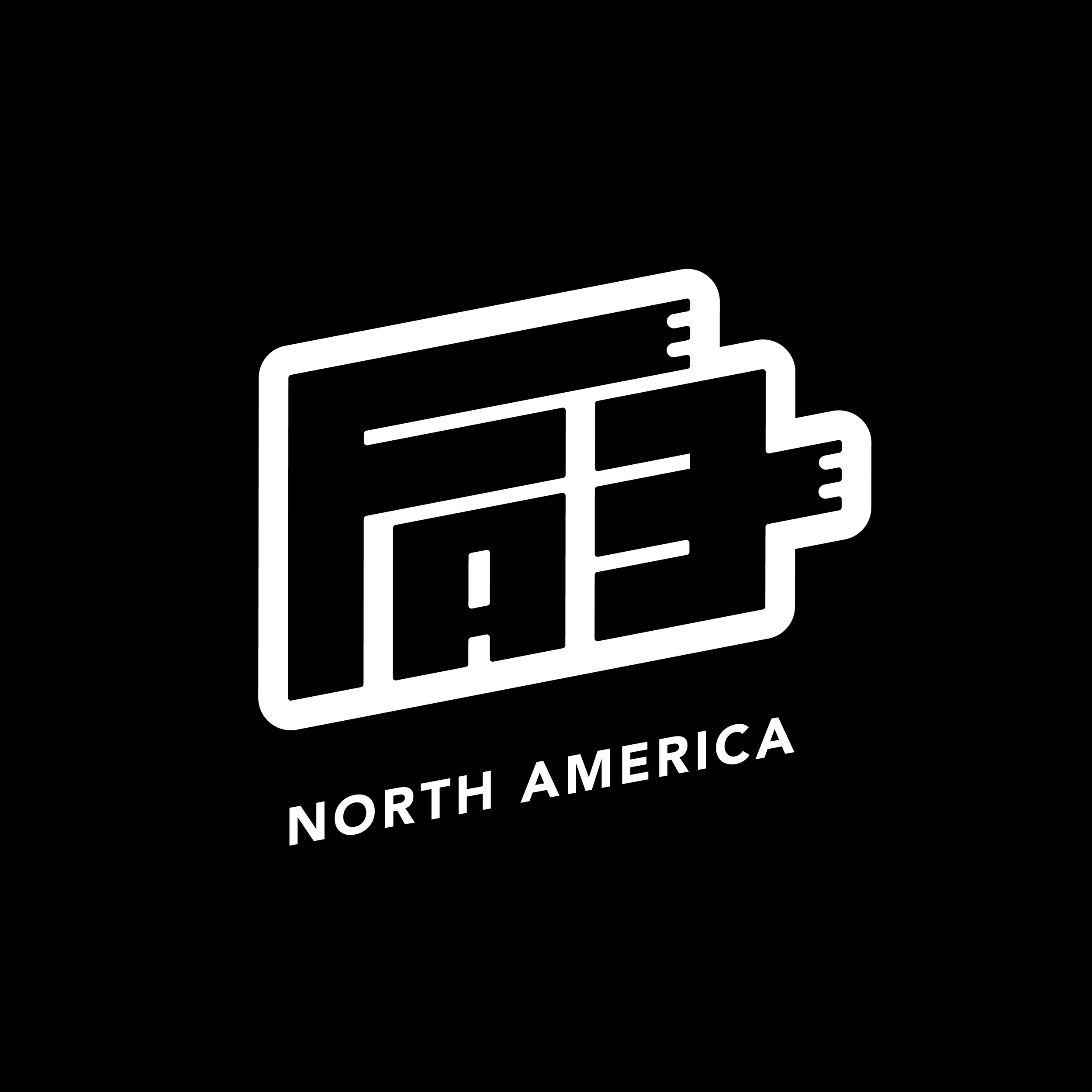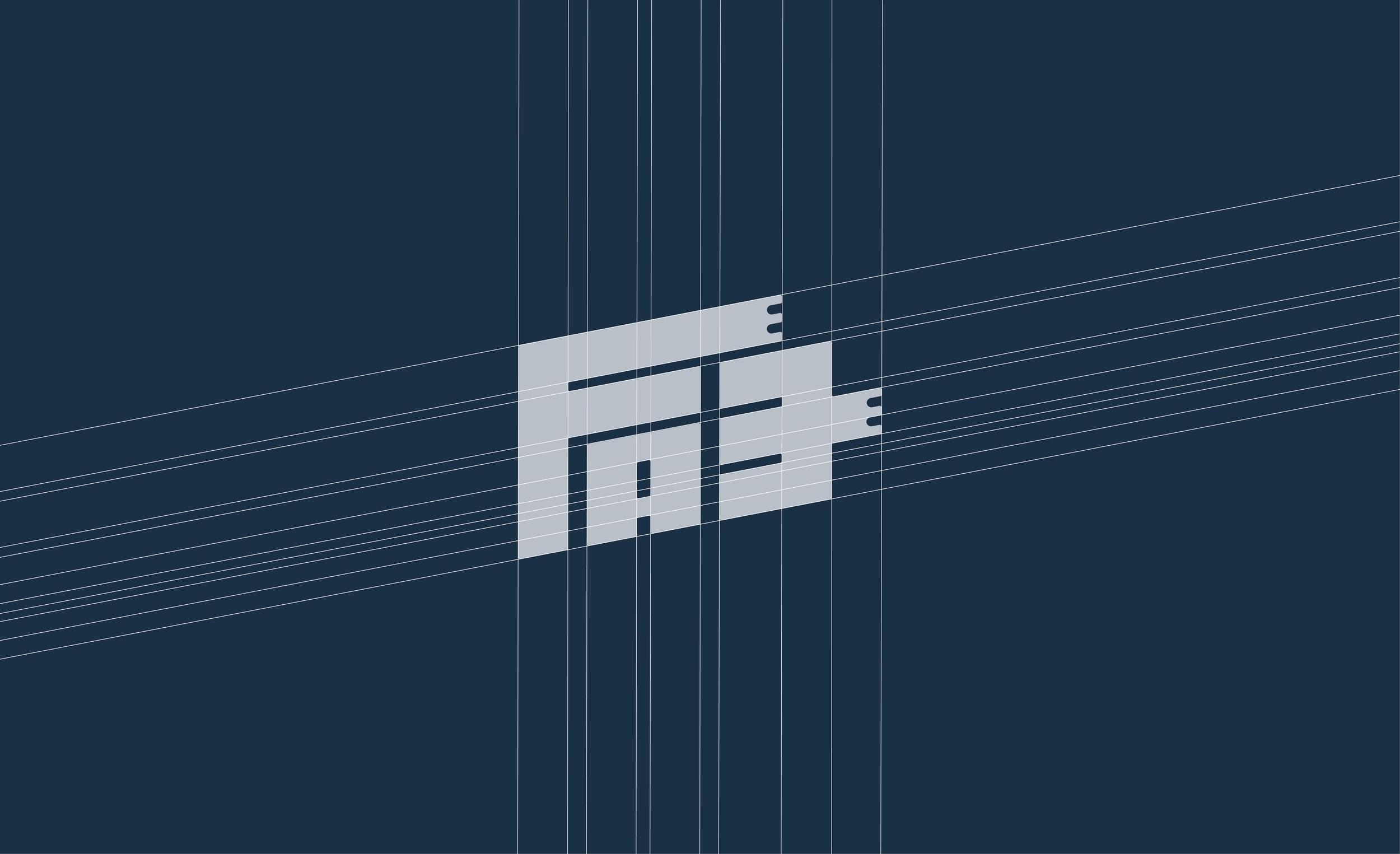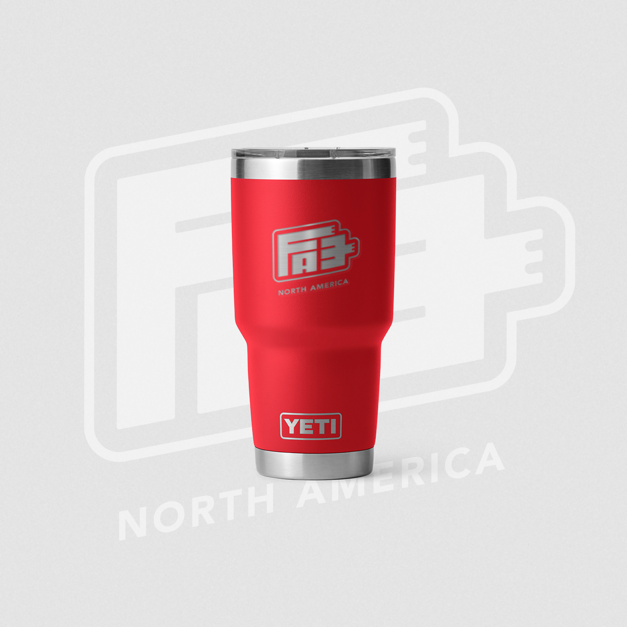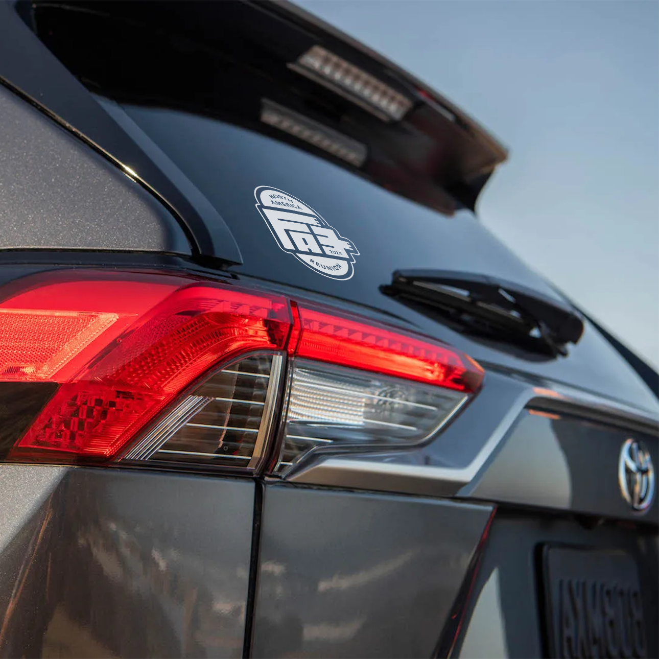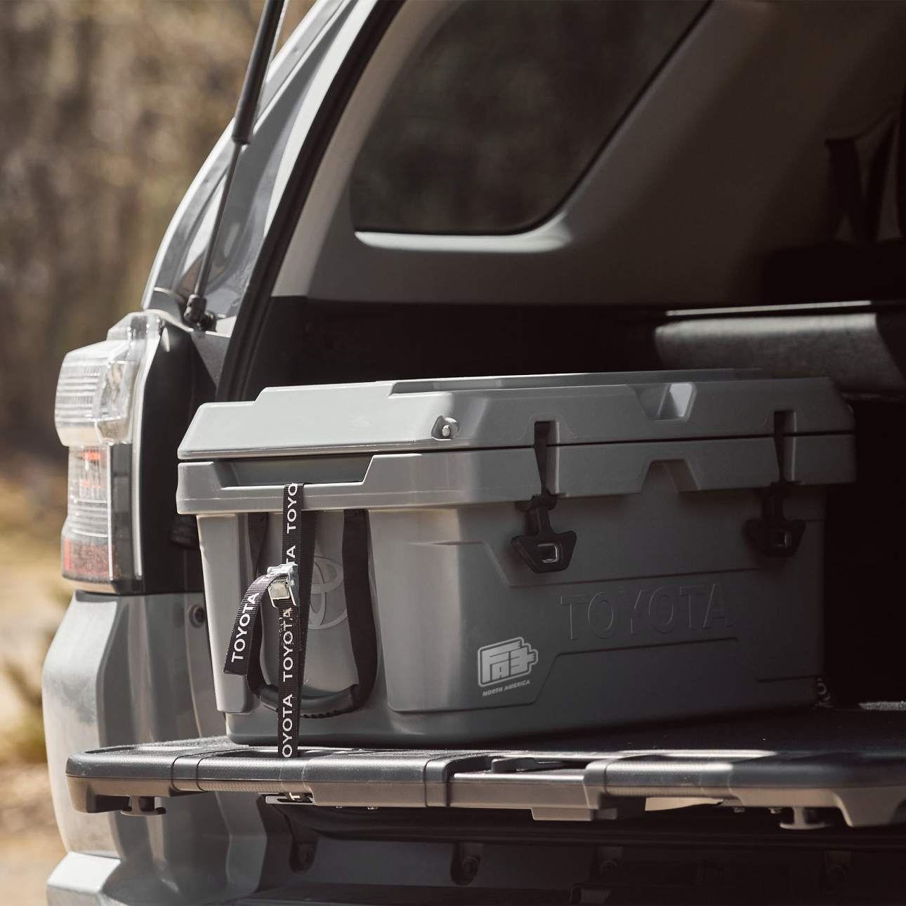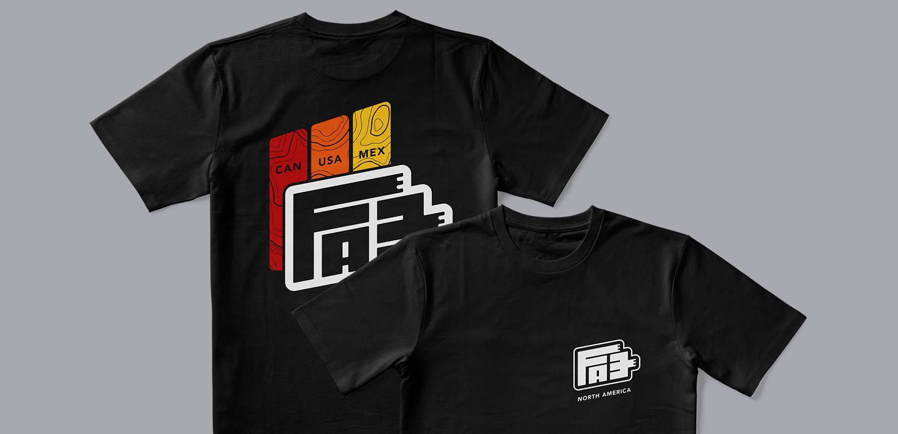

Designing the logo for Toyota motors final assembly engineering dept.
We worked with Toyota’s Final Assembly Engineering Department (FAE) to come up with an unofficial logo for the team to use for internal branding, merchandise, and documentation.
This project presented an interesting design challenge: crafting a mark that felt fresh and celebratory while respecting Toyota's established brand guidelines. The resulting design needed to be recognizable as part of the Toyota family, yet possess its own character to resonate with the FAE team and the spirit of the reunion.