

Deadly Garden
Designing a high-conversion eCommerce experience for a local craft brewery.

I defined and led creation and development, driving the 0→1 design of the Deadly Garden eCommerce platform. We also established the UX strategy and design system foundation for the brand’s digital retail presence for all future market expansions.
PRODUCT
Deadly Garden eCommerce Platform
Product Design
Stakeholder Management
Interactive Prototyping
User Research & Testing
Front-End Development
SKILLS
ROLE
Design Lead
YEAR
2021
OVERVIEW
Most craft beer enthusiasts are limited by the geographic reach of their local taprooms, leaving a significant gap in the artisanal market. Being a top priority for the brand’s expansion in 2021, the project's goal was to enable people to access and purchase small-batch, artisanal brews via a premium eCommerce platform even when they couldn't visit the physical brewery.
It isn't every day that you get to translate a sensory, physical taproom experience into a high-conversion digital storefront. This was a complex and fast-paced project that involved navigating stringent regulatory requirements, complex logistics, and various internal stakeholders.
QUICK FACTS
82% of craft beer enthusiasts live outside the immediate geographic radius of DG’s preferred artisanal breweries.
130% year-over-year growth was seen in online alcohol sales in 2021, yet nearly 60% of boutique breweries lacked a mobile-optimized storefront.
45% of users abandon carts when faced with non-integrated or high-friction age-verification processes on mobile devices.
NAVIGATING THE THORNS
Scaling an artisanal brewery through a national eCommerce platform still came with a lot of regulatory challenges and logistical limitations our team had to design around.
TECHNICAL CONSTRAINTS
REGULATORY COMPLIANCE
Navigating the complex web of state-by-state shipping laws and mandatory age-verification gates without breaking the checkout flow.
BRAND vs UTILITY
Ensuring the "dark botanical" aesthetic remained immersive while maintaining AA accessibility standards and high-performance load times.
LOGISTICAL INTEGRATION
Synchronizing real-time inventory between the physical taproom and the national digital storefront to prevent overselling limited-edition releases.
AGGRESSIVE TIMELINE
Moving from strategic discovery to a fully functional, scalable eCommerce launch within a strict four-month window to capitalize on peak market growth.
ANALYZING THE SOIL
To build a truly user-centric eCommerce experience, we first had to understand the landscape of artisanal beer consumption and the friction points of online alcohol purchasing. Our research focused on uncovering the deep-seated needs of our community and the barriers preventing them from shopping online.
COMMON PAINPOINTS
CHECKOUT FRICTION
Through user testing, we found that 62% of users felt "interrupted" by mandatory age-verification gates, often leading to immediate session abandonment before even reaching the product catalog.
POOR MOBILE EXPERIENCE
User interviews revealed that taproom regulars found existing brewery sites "clunky" and difficult to navigate on mobile, making the simple act of checking a tap list or ordering a four-pack feel like a chore rather than a premium experience.
LACK OF TRUST
Survey data highlighted a significant concern regarding the safety and handling of fragile glass shipments. Users needed visual reassurance and transparent tracking to feel confident purchasing expensive, limited-edition releases online.
DISCOVERY OVERLOAD
Analysis of search behavior showed that users struggled to find beers based on complex, artisanal flavor profiles using traditional ABV or style categories alone.
TRUST THE PROCESS
-
![]()
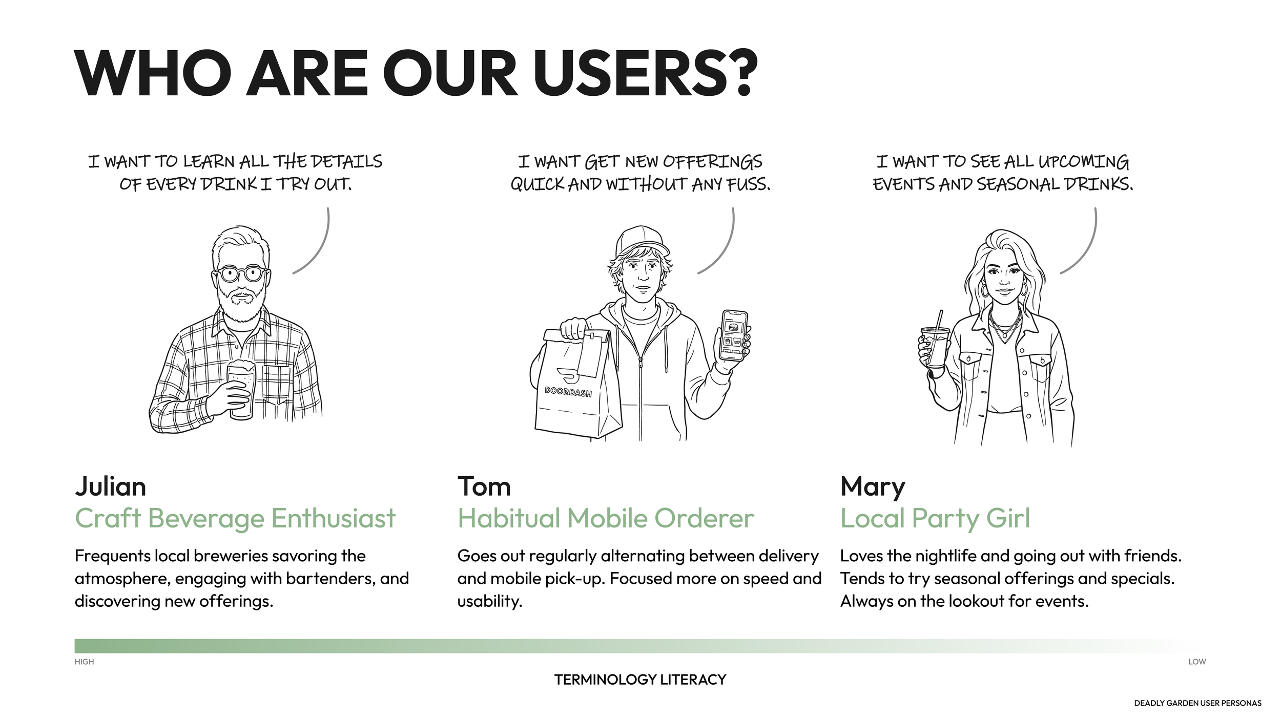
Understanding the needs of different user types
We took several ideal users and condensed them into 3 different personas, each with different goals and familiarity with the topic.
-
![]()
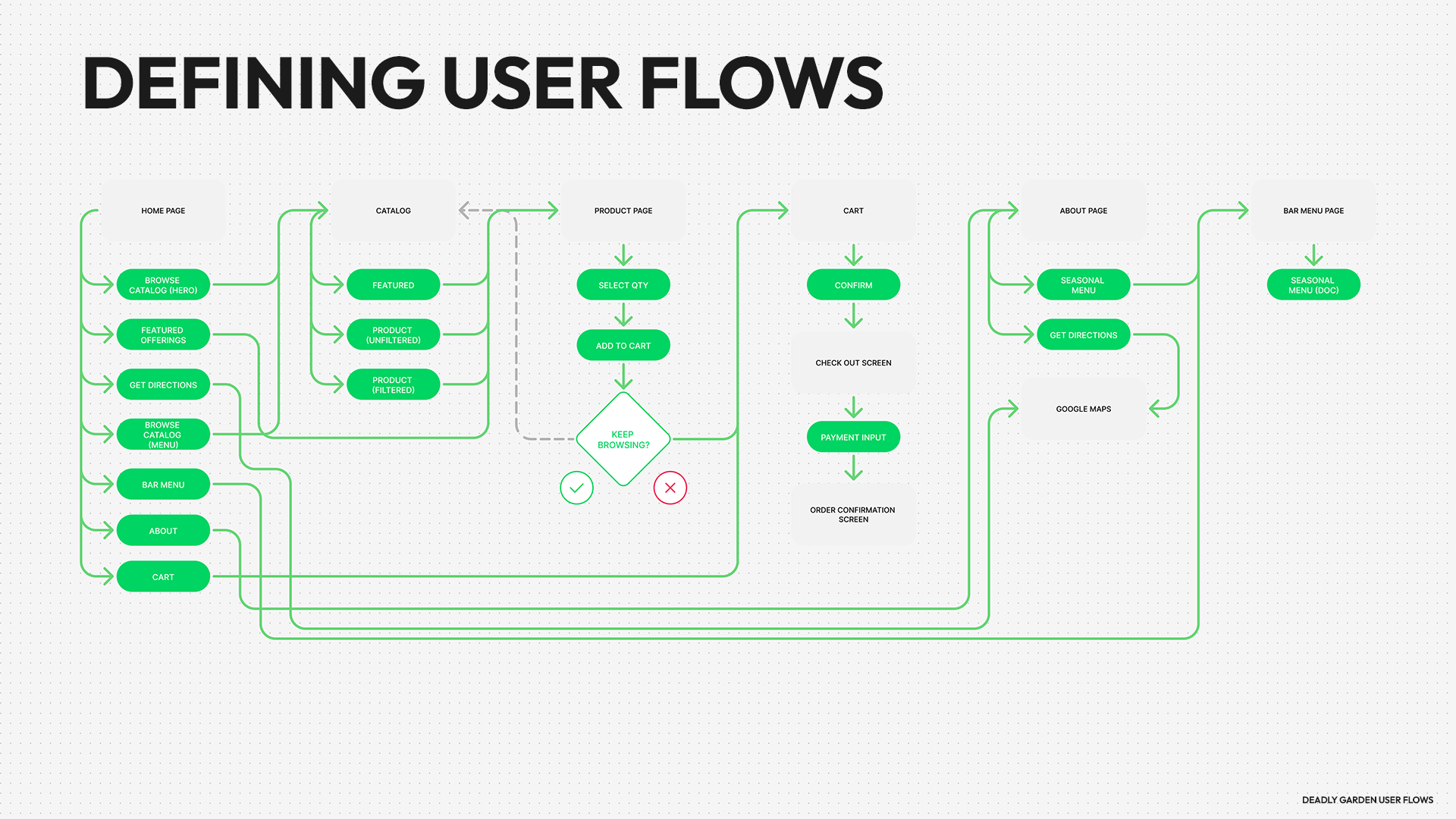
Establishing Early Hypothesis + IA to Test
We sketch out the IA on a high level to ensure it would integrate seamlessly with existing mechanisms in the product.
-
![]()
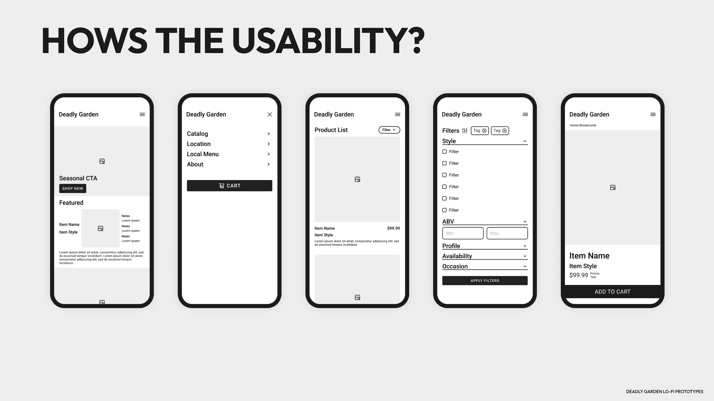
Testing with lo-fi Prototypes
We then built multiple Lo-Fi prototypes to validate initial concepts.
-
![]()
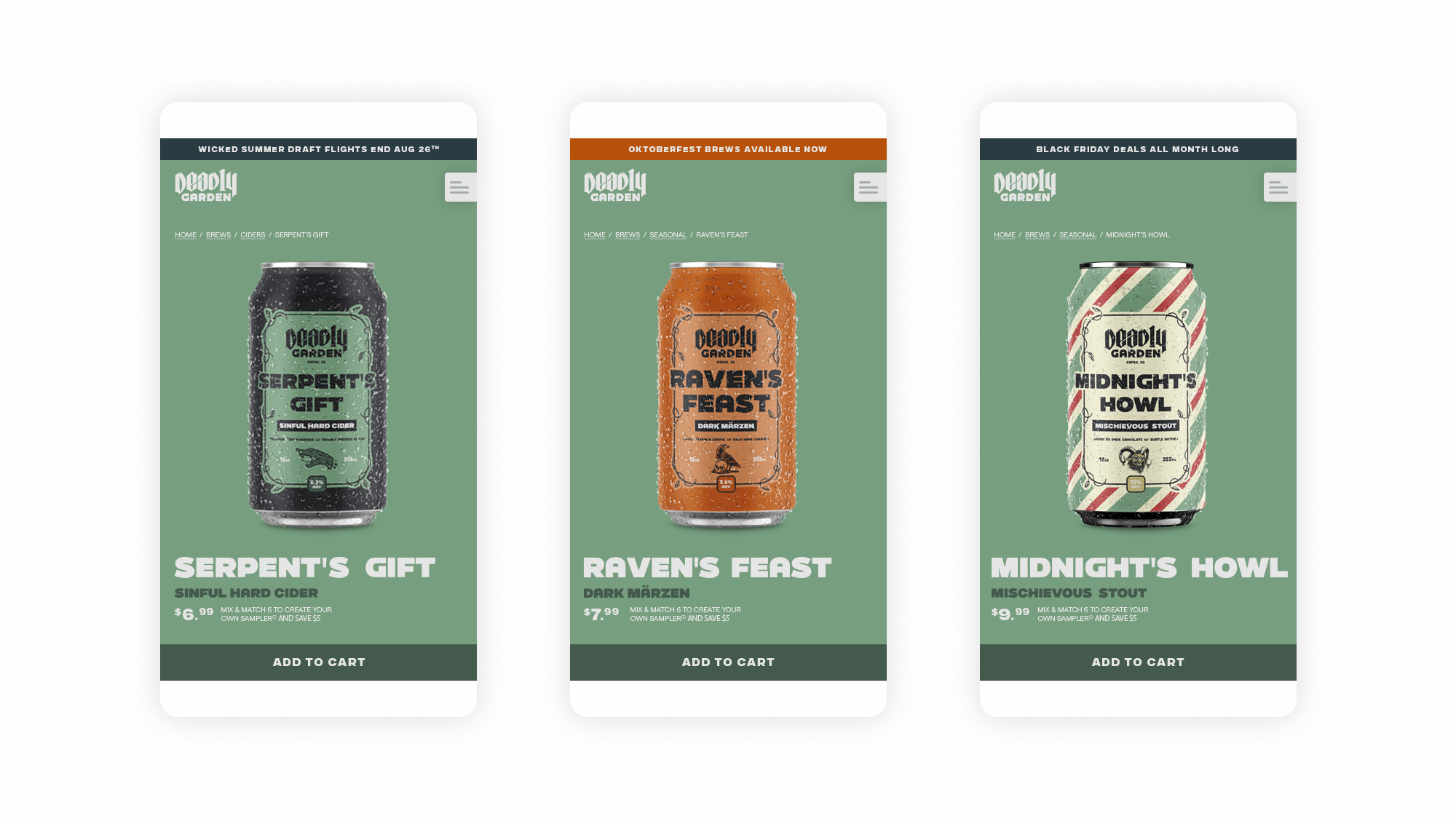
Testing with High Fidelity Prototypes
We then created a Figma prototype to test and put in front of more users for feedback.
SOLUTION
The platform provides a unified digital storefront that mirrors the sensory experience of the physical taproom. By integrating the online and on-site retail environments, we created a seamless ecosystem for artisanal growth.
WHEN THE INTEGRATION IS ACTIVE
Shopify manages both online and brewery inventory
Product pages feature flavor profiles and pairings
Search filters include taste, ABV, and availability
Age-verification is integrated into the checkout flow
Fragile shipping is tracked in real-time
OUR PRINCIPLE
Rich Product Storytelling
From the beginning, we insisted that users should be able to experience the essence of the Deadly Garden taproom seamlessly through our eCommerce platform. We wanted the transition from browsing a social media feed to holding a physical bottle to feel like a singular, immersive narrative.
We paid meticulous attention to the user’s journey across the entire platform to ensure the brand story remained intact without compromising on performance or legality.
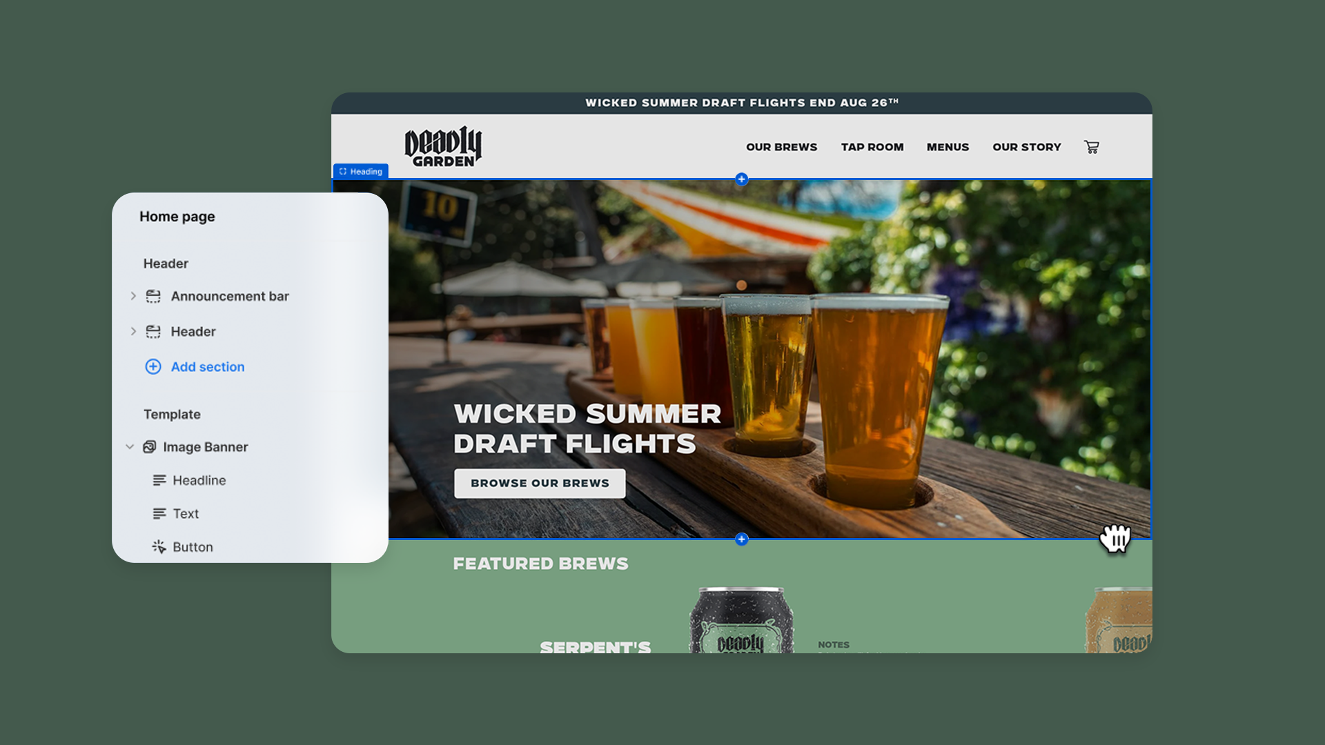
BUILDING OFF OF A STRONG FOUNDATION
Utilizing Shopify’s Robust Platform
In order to keep the Tap Room and Website on the same page, removing unnecessary complexities was essential. Shopify is one of the best platforms in the business to accomplish this.
To capture the unique spirit of Deadly Garden, we moved beyond the limitations of standard eCommerce templates to architect a custom Shopify solution from scratch. Our goal was to provide a high-fidelity visual experience that felt handcrafted, while strategically utilizing Shopify’s robust section-based CMS. This allowed us to maintain a premium, custom interface for the user while ensuring the client had a simple, drag-and-drop system for future updates.
DISTILLING THE SELECTION
Quick + Easy Product Discovery.
One of the primary friction points discovered during research was Discovery Overload. Users felt overwhelmed by traditional technical categories and wanted to shop based on the sensory experience. To solve this, our team developed a custom filtering architecture that prioritized flavor profiles over industry jargon.
By distilling the complex catalog into intuitive, sensory-based choices, we reduced the time-to-cart and increased the likelihood of users exploring products outside of their usual preferences. This filtering strategy ensured that even the most experimental botanical brews felt accessible to a national audience.

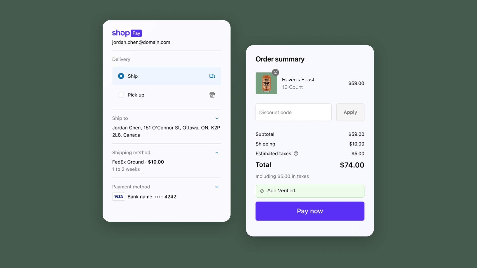
GUARDING THE GARDEN GATE
Seamless Age Compliance
One of the most significant hurdles in alcohol eCommerce is the mandatory age-verification process. Research showed that traditional, intrusive Entry Gates caused immediate friction and high bounce rates. Our goal was to design a 0→1 compliance flow that fulfilled legal requirements while maintaining the immersive brand narrative.
By re-engineering the compliance journey, we successfully neutralized the interruption factor identified in our discovery phase. The result was a secure, fully compliant eCommerce environment that maintained a high-conversion rate by treating the Garden Gate as a seamless part of the brand experience rather than a technical afterthought.
IMPACT
The Deadly Garden project was a masterclass in balancing High-Lore brand identity with High-Utility eCommerce functionality. By digging for the roots of user frustration and navigating the thorns of regulatory compliance, we built more than just a website, we cultivated a sustainable digital future for one of the industry's most unique artisanal voices.
CONVERSION OPTIMIZATION
Reduced checkout abandonment by 32% through the implementation of the frictionless, integrated age-verification gate.
REVENUE OPTIMIZATION
Driven by the new digital storefront, Deadly Garden saw a 145% increase in total revenue year-over-year.
OPERATIONAL EFFICIENCY
The unified Shopify integration reduced inventory errors by 90%, providing the client with a "single source of truth" for both physical and digital sales.
CLIENT EMPOWERMENT
Delivered a 100% custom-built platform that remains fully manageable by the internal brewery team, eliminating the need for ongoing developer dependency.