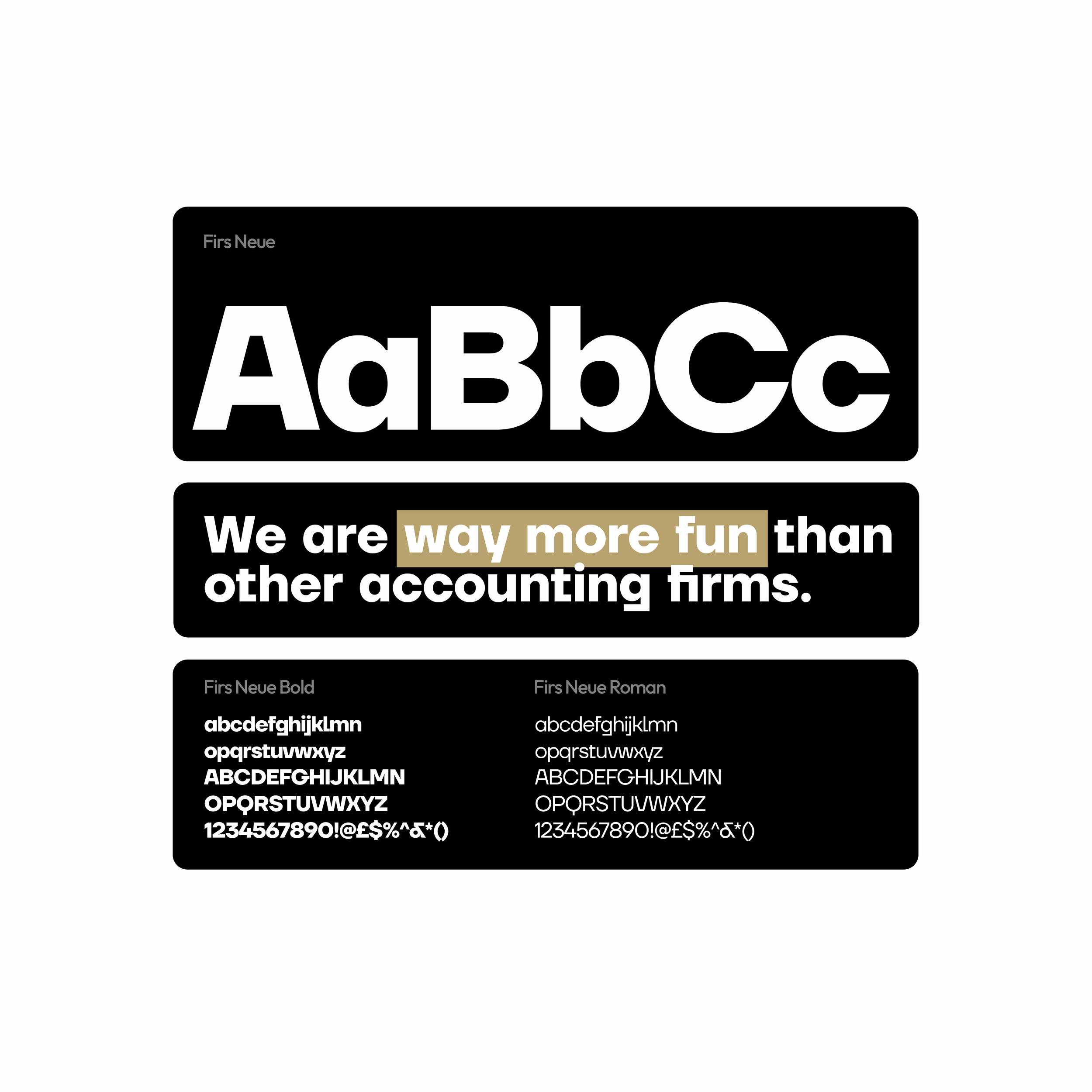
way more fun than other accounting firms.
The term "beancounter," often used to describe accountants, originally referred to meticulous record-keepers who obsessively tracked every penny. At Beancounter, they've flipped the script. Ditching the stuffy suits, they bring a down-to-earth approach to accounting, empowering small businesses in Kentucky and beyond. Their team of friendly experts provides bookkeeping, tax prep, and financial coaching, all tailored to your specific needs.
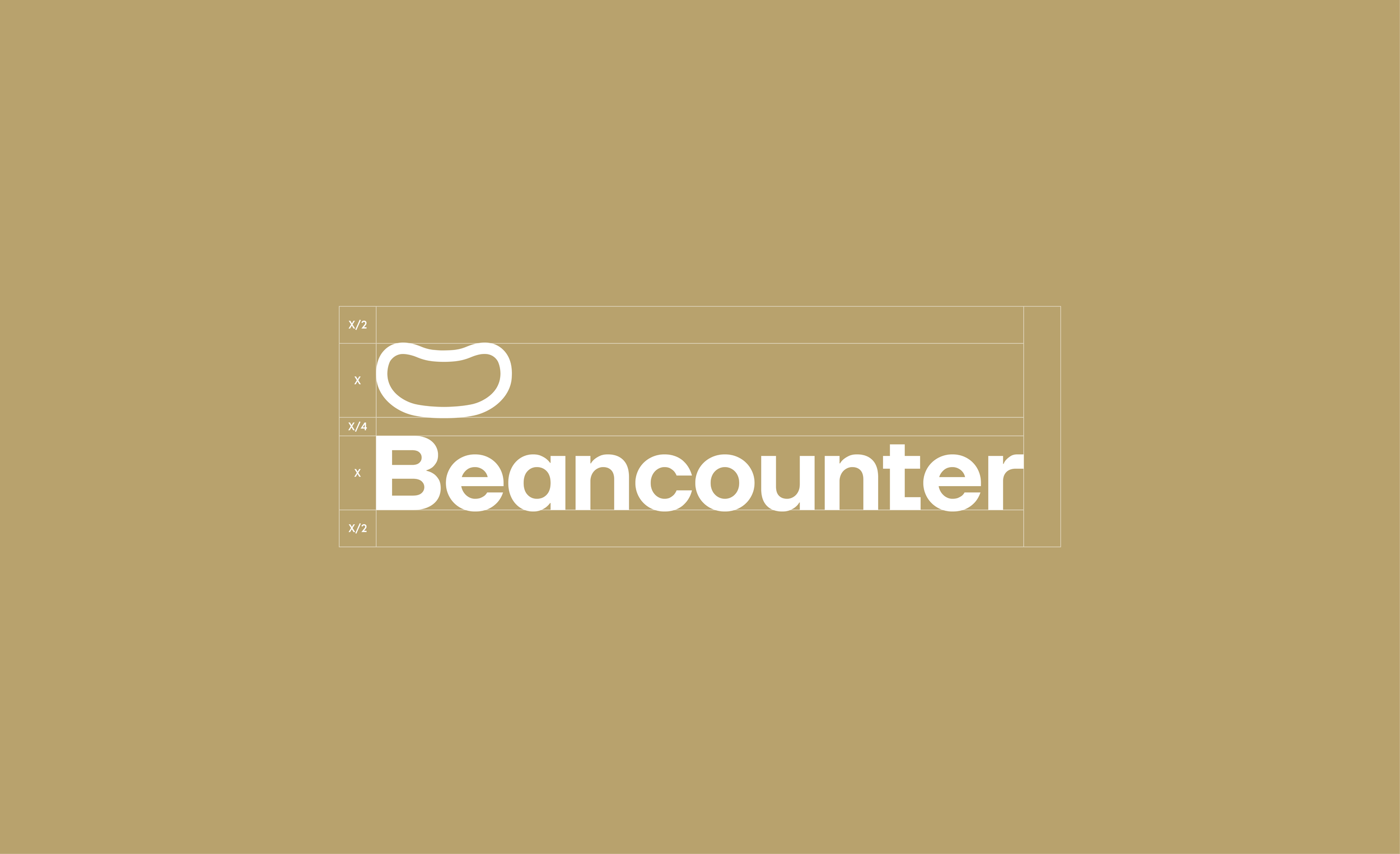
To further enhance Beancounter's brand identity, we collaborated closely with their team to refine their logo. This involved modernizing the existing logo, streamlining its elements for a cleaner, more contemporary look. A new, custom typeface was developed to better reflect the brand's friendly yet professional personality. Several alternative "lockups" were created to provide flexibility in various applications, ensuring consistent branding across all platforms. These updates resulted in a stronger, more distinctive brand identity that effectively communicates Beancounter's unique approach to accounting services.
BEFORE
AFTER
